Contact

CEPT University

2024-25 Institution

CEPT has an audacious legacy. It needed a website that effectively told that story. Their 2025 redesign, made with Miranj, sets course for a strong future.

StrategyDesign
Web

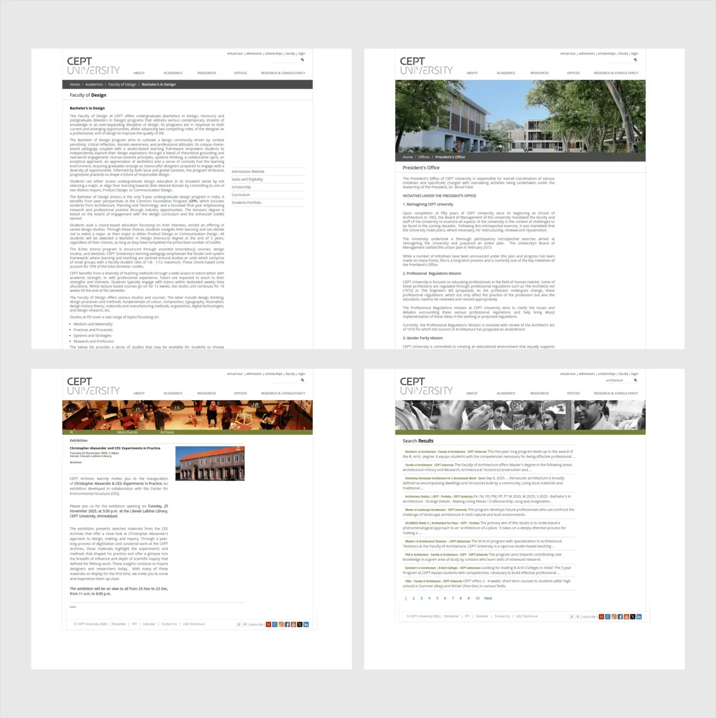
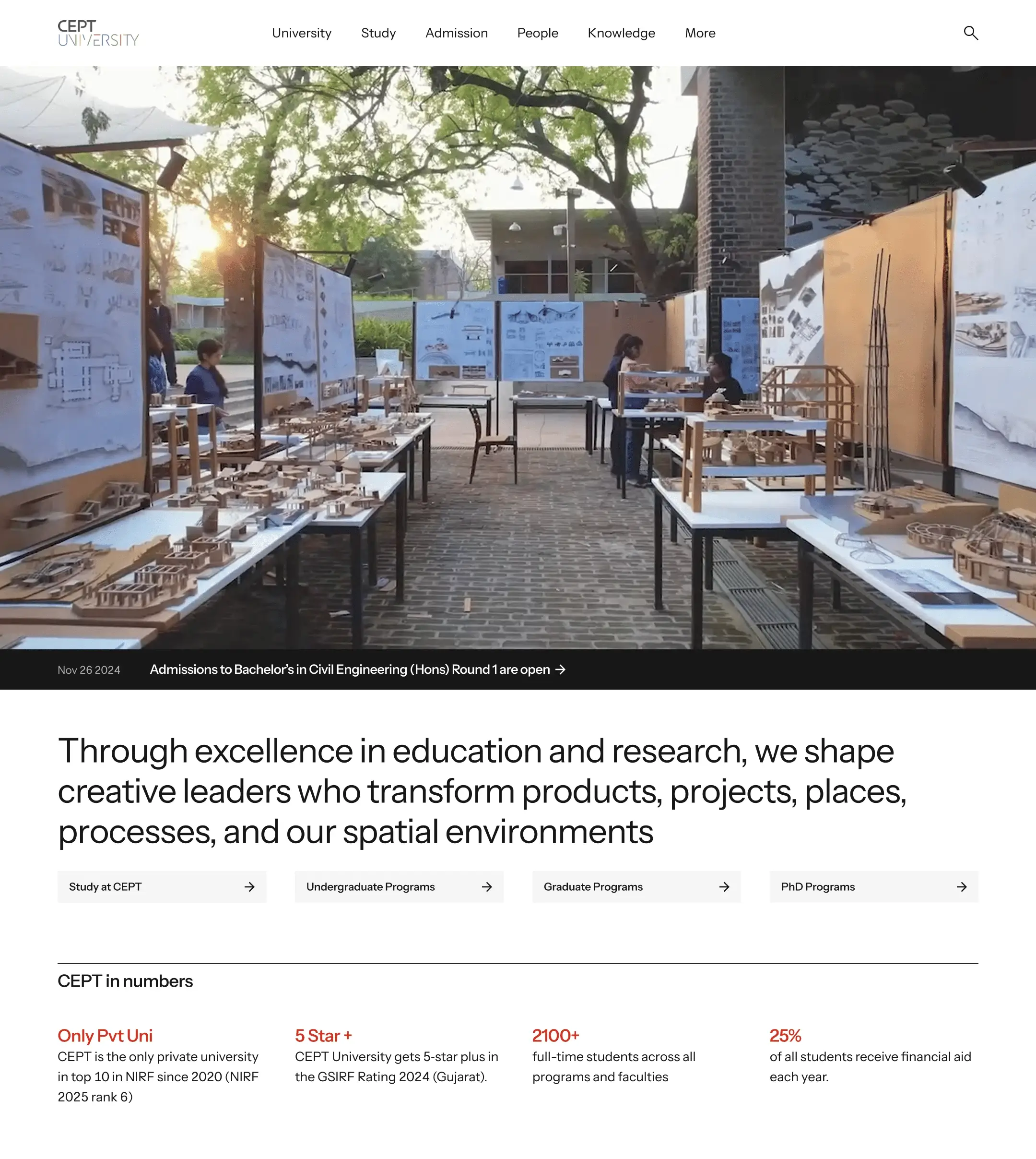
Founded in 1962, CEPT University in Ahmedabad started out as a school of architecture, but it has grown to encompass design, planning, management, and technology. As the university evolved, its online presence didn’t quite keep up. It became clear that their website needed a complete overhaul to truly reflect what CEPT is today.

This project was a joint effort between two creative studios. 3 Sided Coin took the lead on visual design, creative direction, and product design, while Miranj contributed their technical know-how to the site architecture and implementation. Both teams worked closely together on product design and the overall website strategy.

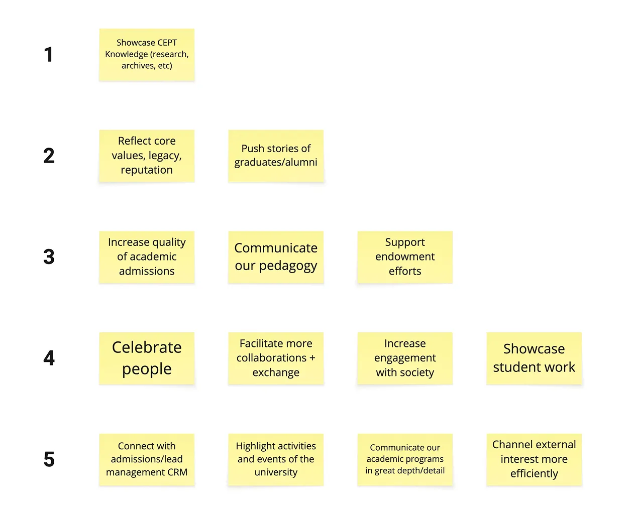
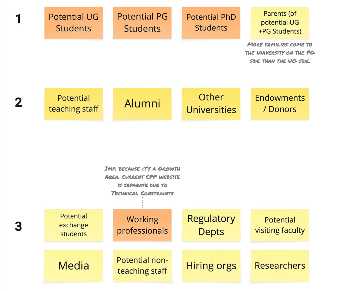
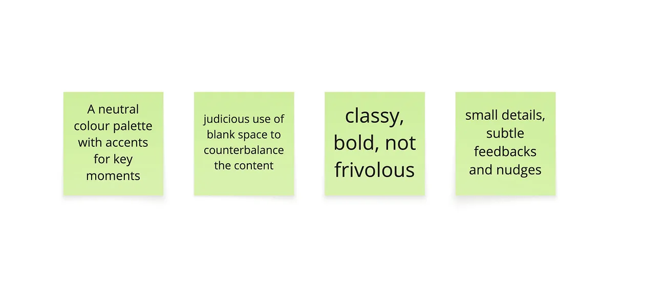
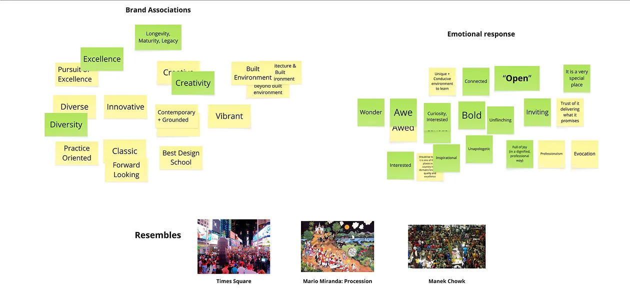
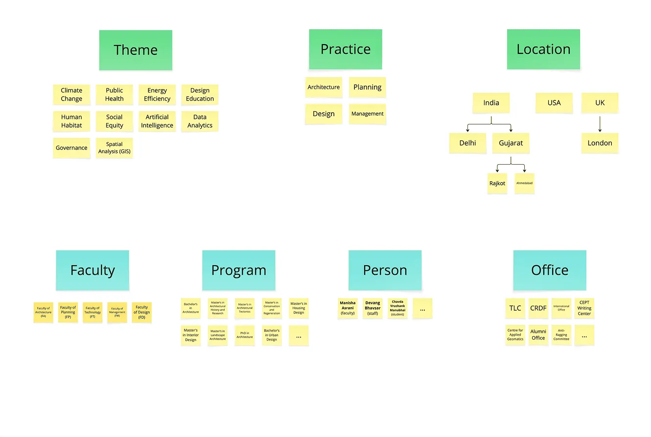
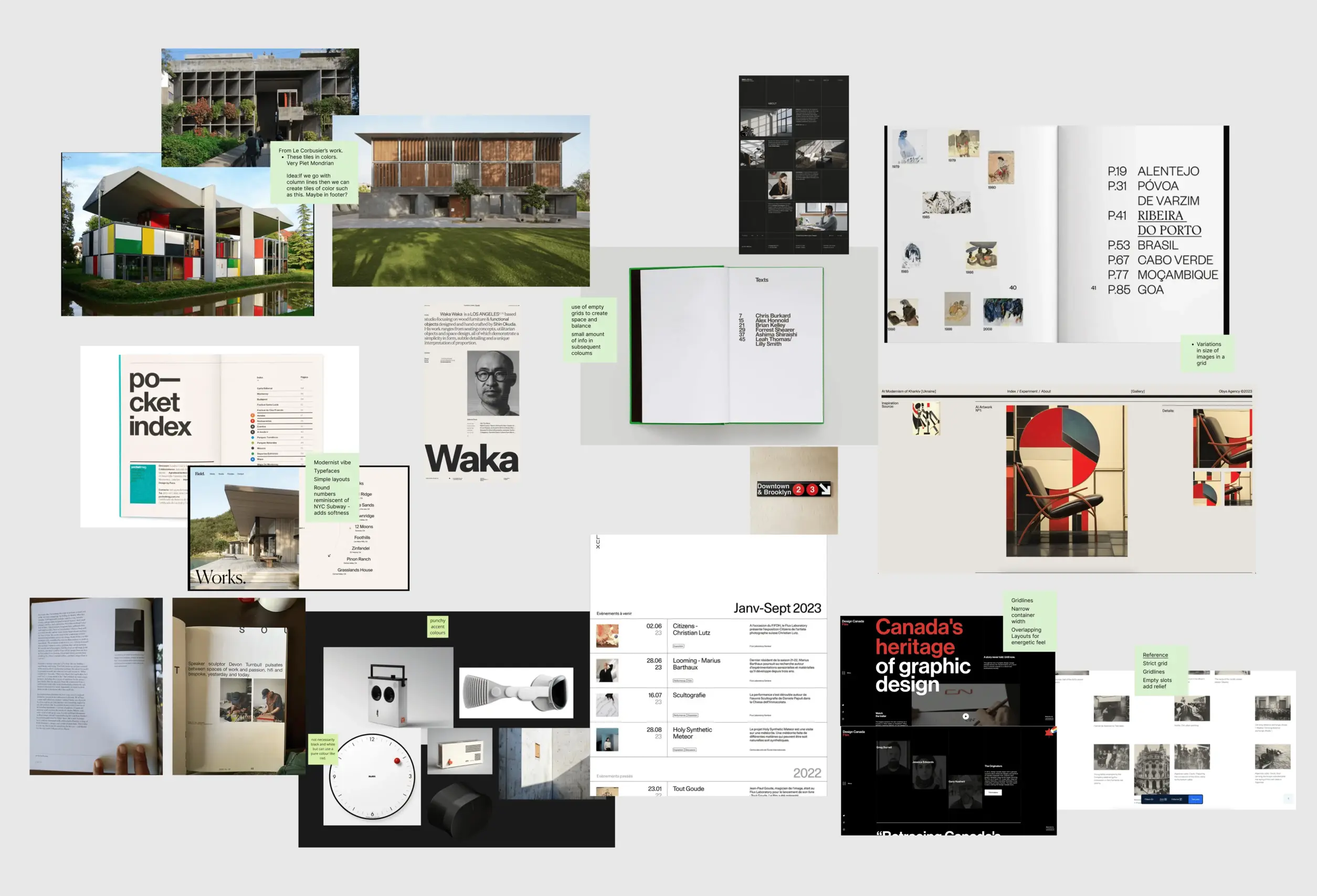
This write-up captures the extensive work that went into the design process.

CEPT university

Previous website

The old website had been the home of CEPT for many years, but it had really started to show its age, both in looks and structure.

CEPT University is a lively institution filled with research, events, publications, student projects, and so much more. However, the previous website and backend system made it tough to locate various types of content, leaving visitors without a real understanding of all that CEPT has to offer.

media assets
Understanding the institution before forming opinions about the site

Led by Miranj, we conducted a week-long discovery workshop on campus with CEPT’s website committee. This helped in defining the website goals and target audience, and order both based on priority.

Clean, classy, a little avant-garde but not frivolous. Bold, with ample white space.

website goals
website goals
audience
audience prioritization
aesthetics
aesthetic values
brand
brand emotion chart
taxonomies
Mapping the relationships

Reviewing all the content from the old website helped organize everything into a clearer structure. This led to a detailed information architecture that shaped the information architecture as an interconnected network between different types of content.

For instance, a student project, instead of being a stand-alone piece, connects to the faculty and program it belongs to, people that made it, the practice area it is under, and more.

Design Approach

The brief guides us toward a clean, editorial aesthetic: strong grids, varied image scale, generous white space, a single accent colour used sparingly, with typography that’s strong but pared down. We pulled references to extract those principles before moving into visual design.

We took a modular approach: in the first phase, we created templates featuring key content that could later serve as the foundation for patterns and components throughout the site.

moodboard
Faculty pages that work as microsites

With all the content present and accessible from the faculty page, it functions like a microsite within the larger website.

faculty microsite
faculty microsite

The “What’s New” section highlights the latest events, news and projects, keeping the pages current. Since content is pulled dynamically, each faculty page feels distinct and reflects the work of the individual faculty.

know what’s happening new
Programme depth without overwhelming the page

The program structure on all program pages is designed to communicate CEPT’s academic programs in great depth and detail. The structure is flexible enough to work across any programs, regardless of the number of semesters or courses.

program index
program index
record your answers
Since each page contains a lot of information, our approach was to progressively reveal it.
record your answers

The website also answers questions about what students and their families expect from their life at CEPT.

life at CEPT
aid at CEPT
Celebration of People

People are at the core of CEPT University. The new design has a shiny new profile page that celebrates their work and invites collaboration.

people
Community Outreach

CEPT hosts events, including exhibitions, talks, seminars, open to everyone in the local community.

event
Event details at a glance and option to register
cept press publications
project main
project page
project detail
project outcome gallery tells a comprehensive story
home
Home communicates everything CEPT is and does to someone who may know nothing about it.
Tags connected to live filters

On most institutional sites, tags are cosmetic. Here every tag links to a filtered index, with the page title confirming what you're looking at. Visitors can follow threads across the site rather than hitting dead ends.

record your answers
index page
record your answers
global search results
Mobile designed alongside desktop

We ran desktop and mobile design tracks simultaneously to make real decisions about hierarchy at every screen size — important for a site most prospective students will encounter on a phone.

mobile screens
All your best bars are my typos!

Throughout this project, we explored multiple directions before committing to anything. Every direction that didn’t make it helped sharpen the ones that did.

Here are some of the iterations and rejected ideas that could probably form another project altogether.

rejected ideas
Outcome

With a new website and a scalable content system in place, CEPT has a solid foundation that should serve them for the good part of the next decade.

We intended to infuse some calibrated chaos to the visual design and hope that soon we might be able to take up a small enhancement that reflects the energetic pace of a student’s experience.

credits —

Design

Avinash

Creative Direction

Kasturi, Tejas