Case Study 2020 current
current
conservation
A long-awaited design update for the website of the reigning sovereigns of conservation-related research in India
A long-awaited design update for the website of the reigning sovereigns of conservation-related research in India
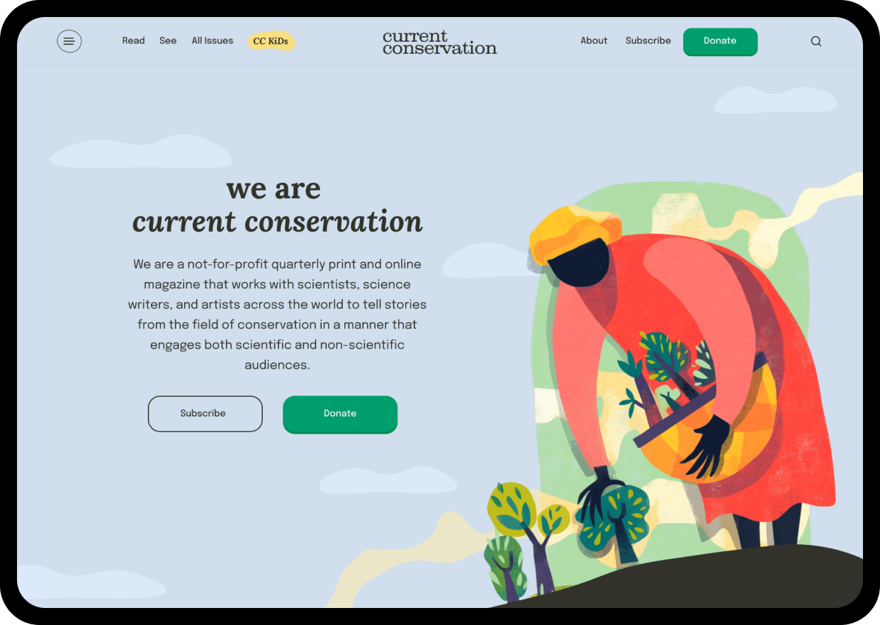
Current Conservation is a vibrant melting pot of art, ecology, conservation research and the social sciences, aimed at both a scientific audience as well as regular folks with no academic background in these areas - something that sets it apart from other conservation magazines.
They have been publishing well-researched stories for a decade - both on their website and as a quarterly magazine.
We were stoked when they reached out to us to celebrate their ten-year anniversary with a sparkling new website.
Speaking to the CC team helped us define multiple objectives of the redesign.
prompt and encourage more people to donate.
improve the overall reading experience on the website.
giving the artwork on the website more prominence.
To kick the project off, we carried out both internal stakeholder interviews with the lovely CC team as well as reached out to a wider group of CC editors and readers to carry out user interviews.
With the reader interviews, we wanted to understand how people were currently engaging with content from Current Conservation as well as conservation-related information and news in general. This helped arm us with a thorough understanding of both the business and user needs before we even attempted to design anything.
it’s difficult for me even to know where to look for stuff on the website.
the tabs and organisation don’t make sense.
I want to explore more stories on a topic but it is impossible to do so.
I hold on to the print issues for the beautiful art.
While the other two objectives were quite clear, speaking to the readers gave us more insights into what the reading and discovery experiences should be.
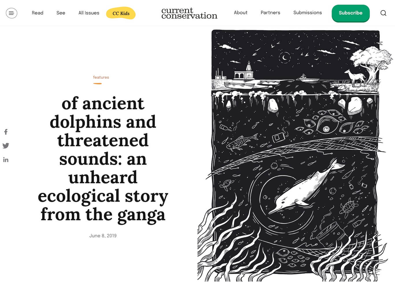
An audit of the content revealed that their stories fell into two large buckets - text and visual.
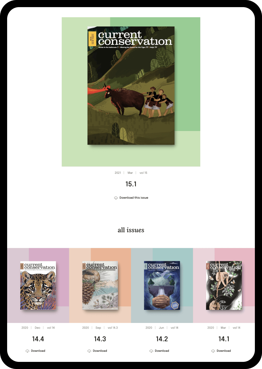
Next - we created a beautiful landing page to browse through all the quarterly issues of the magazine.
As an open-access, not-for-profit magazine, one of the major objectives for the redesign was to encourage more people to donate to the magazine.
Modular blocks designed for Donations using some awesome art from CC’s arsenal are strategically placed at different stops in a reader’s journey such as story listings, between sections and at the end of each story.
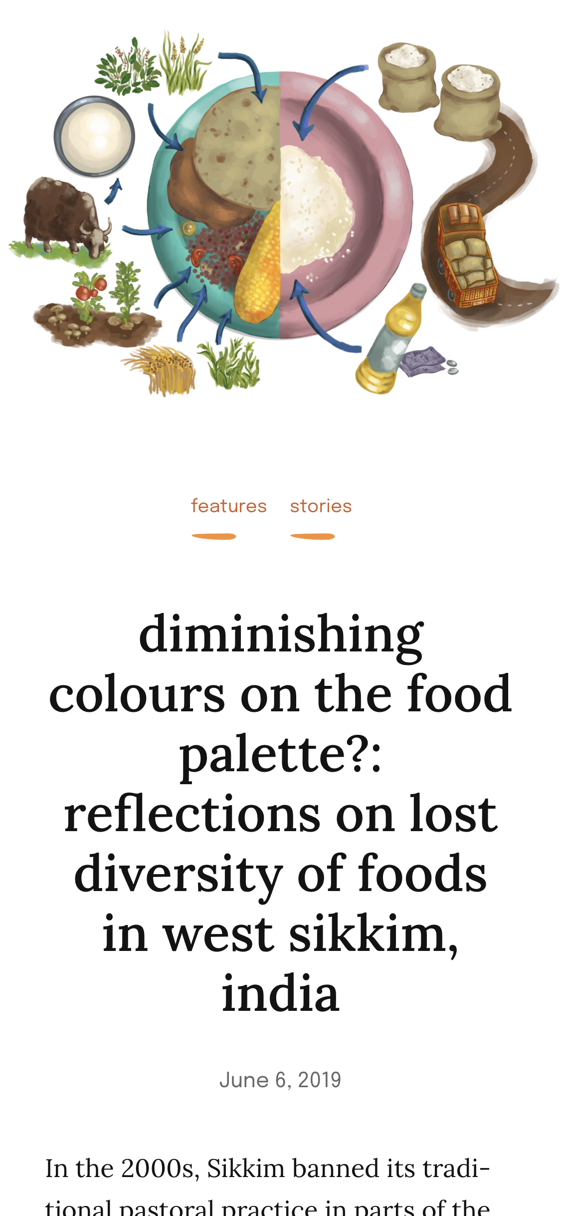
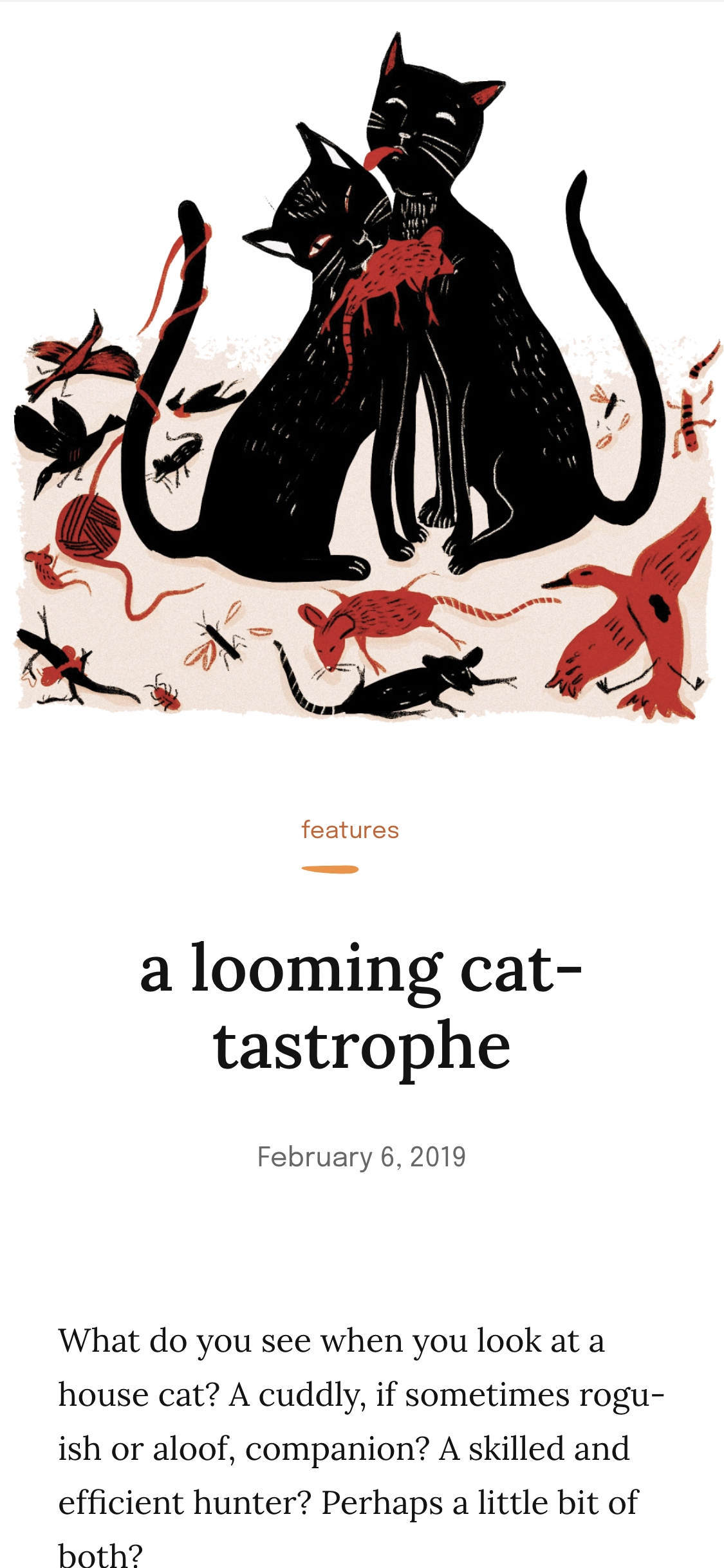
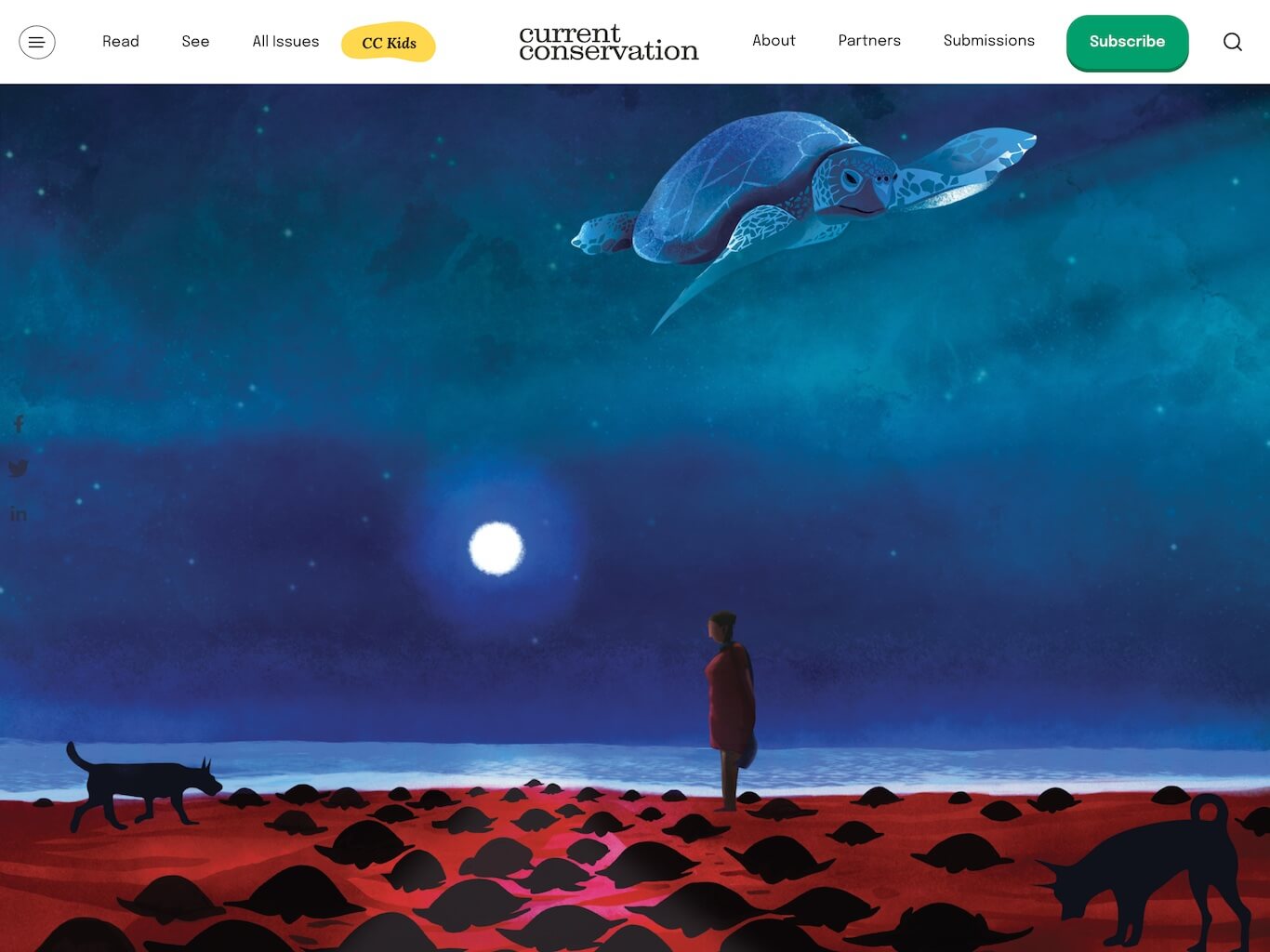
Giving more prominence to the art by India’s most promising artists in the magazine was third major goal of this redesign.
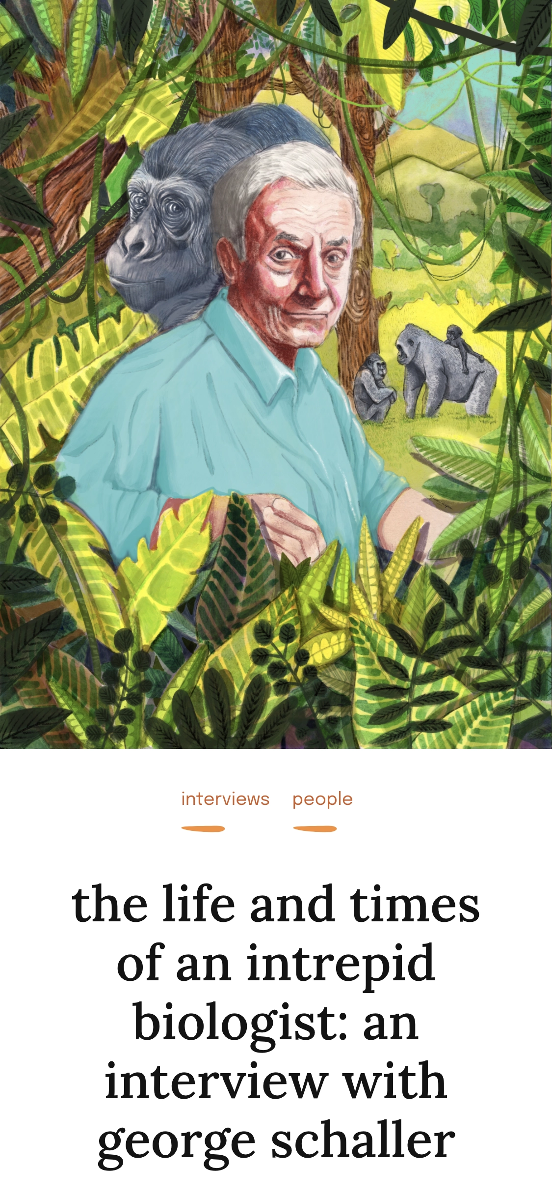
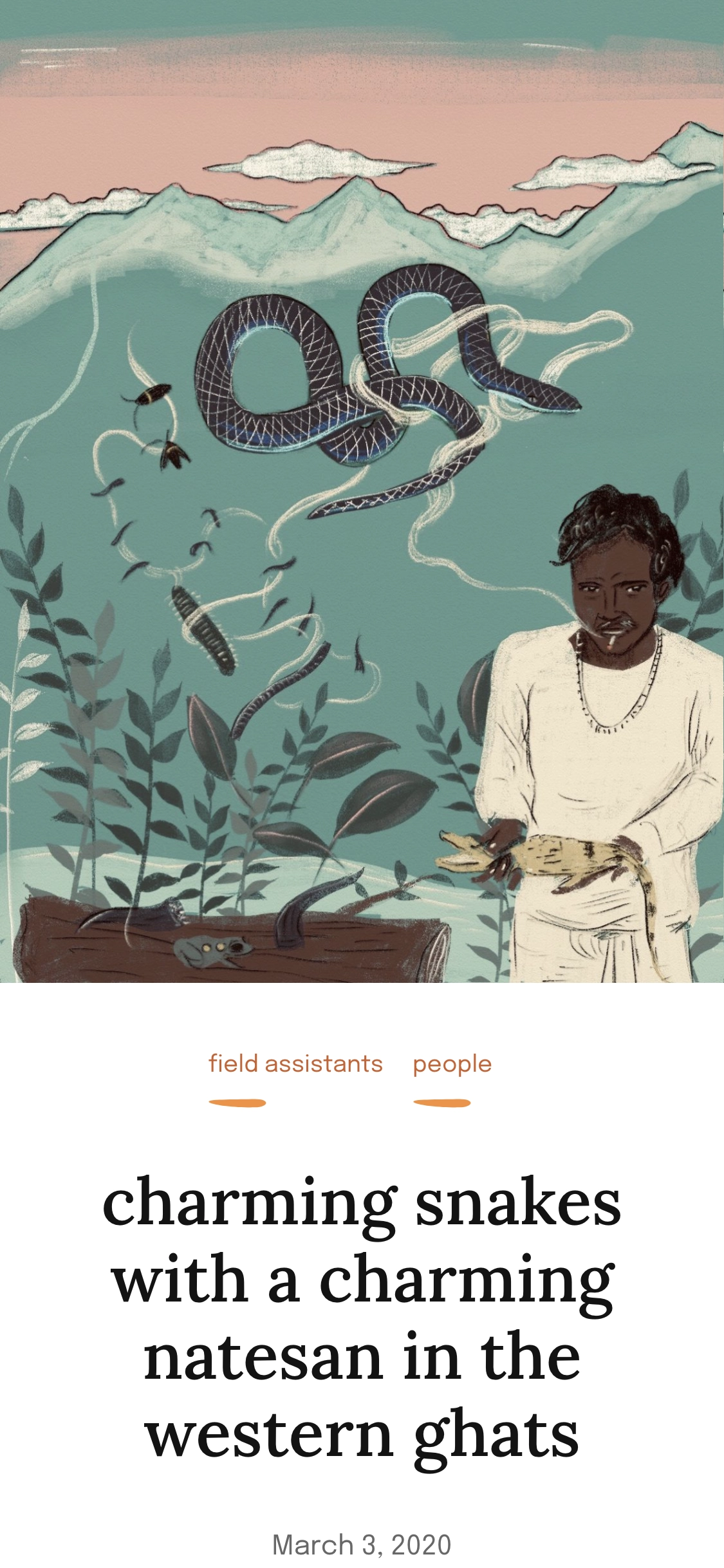
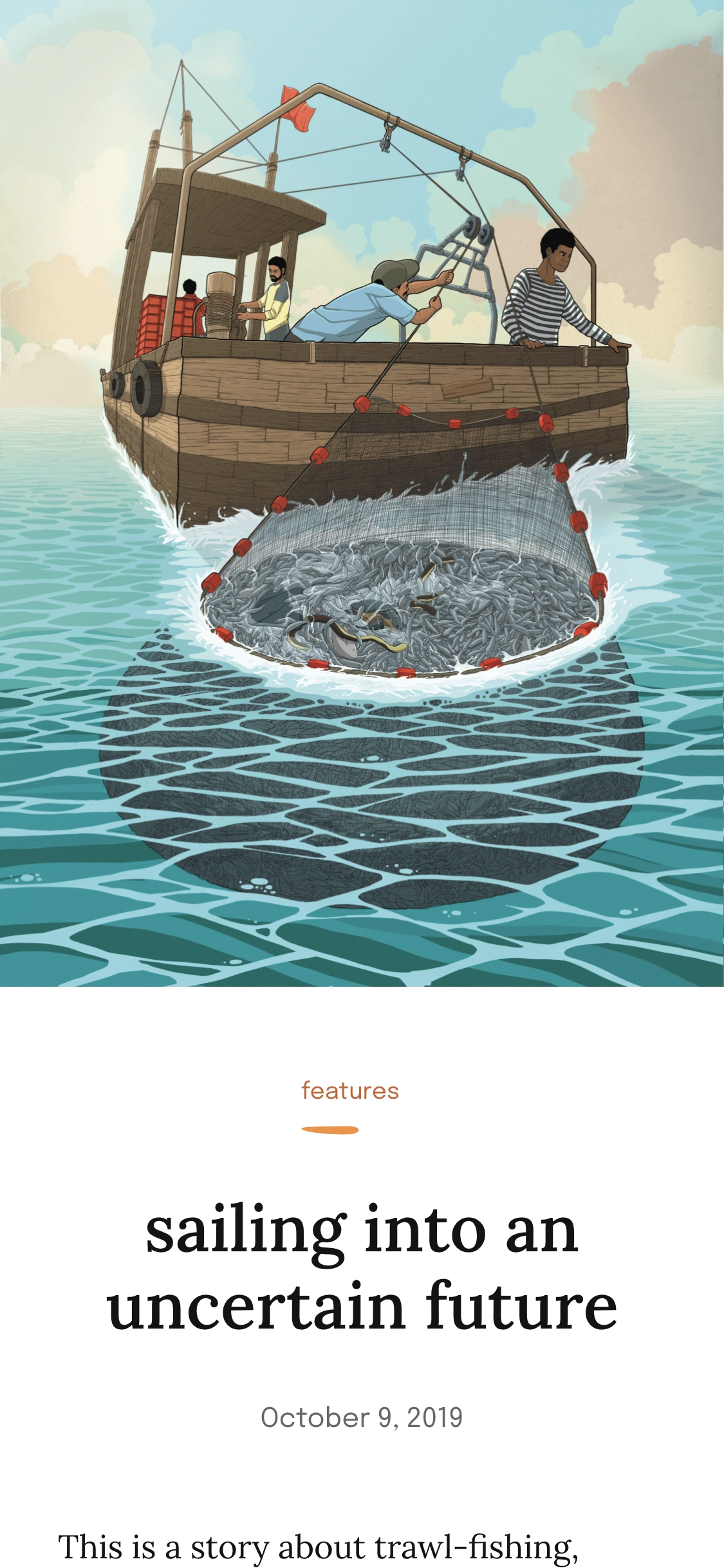
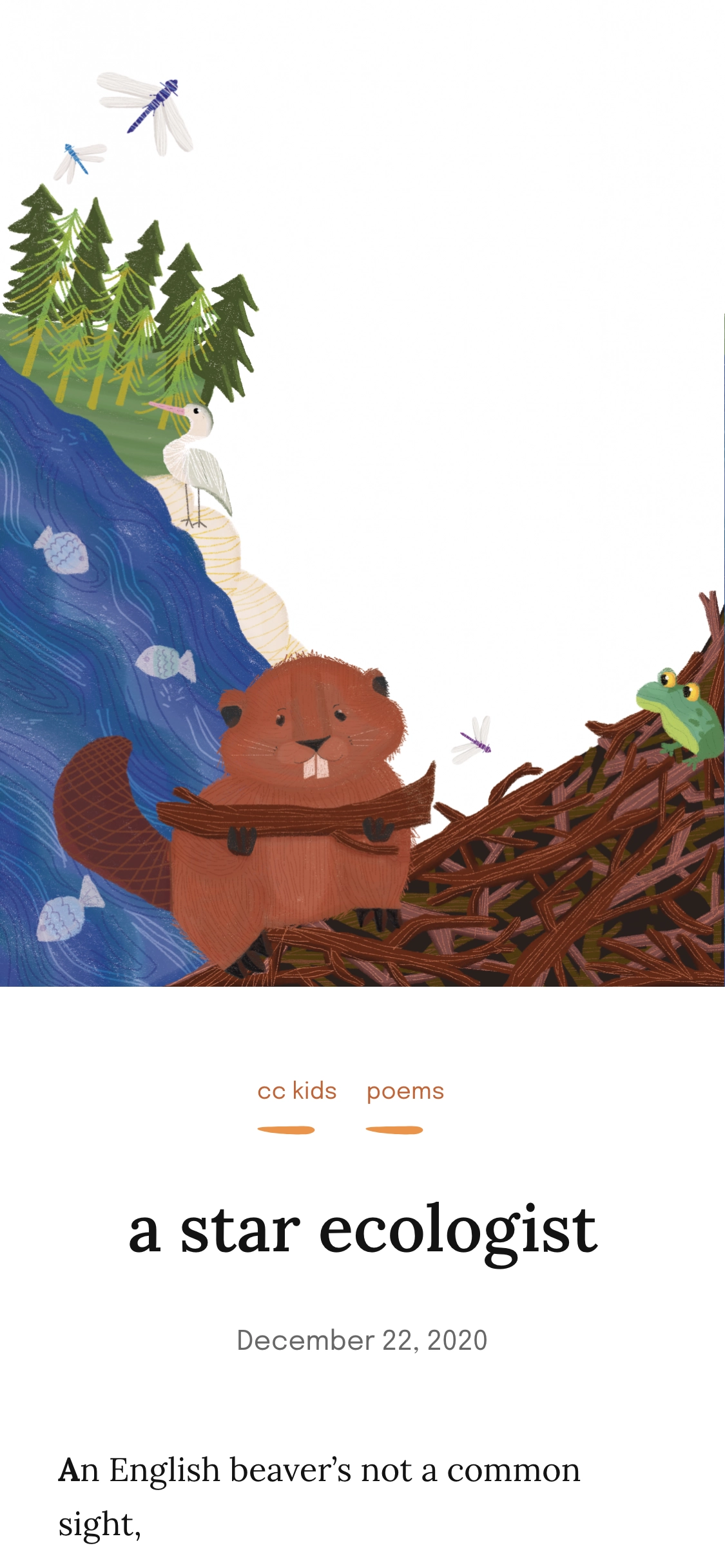
We designed a separate template for portrait-mode illustrations to bring the best out of them in a natural layout.