Contact

UrbanClap

2019 hyperlocal, e-commerce

tl;dr: we collaborated with India’s biggest hyperlocal marketplace to make their check-out 50% faster 🚀.

urban company new user checkout flow

UrbanClap (now Urban Company) is a hyperlocal home-services marketplace in India. People from more than 17 cities across the world use it to book a wide range of services, from in-house massages to home maintenance, from a network of over 25,000 micro-entrepreneurs.

  • 10 million+ downloads on
    Google Play Store
  • 4th most popular app on
    Apple App Store

Safe to say, there’s quite a lot of people relying on Urban Company on a daily basis to fix their leaking toilets and broken ovens, blow dry their hair and paint their nails before special occasions.

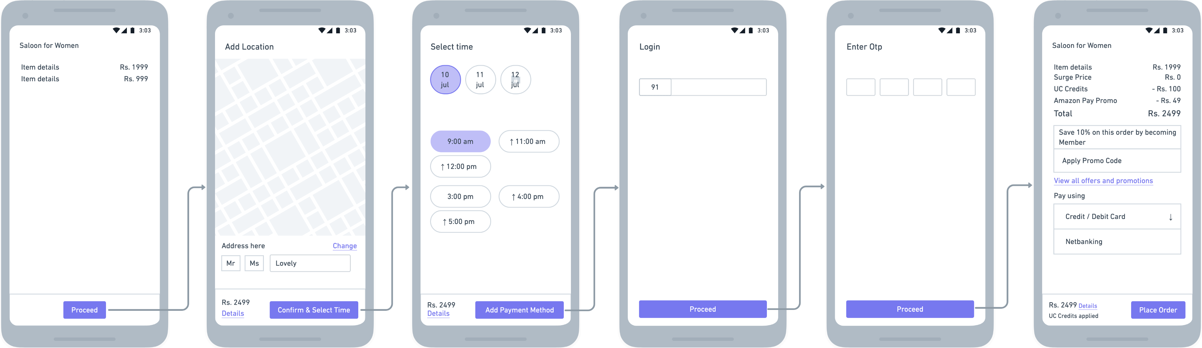
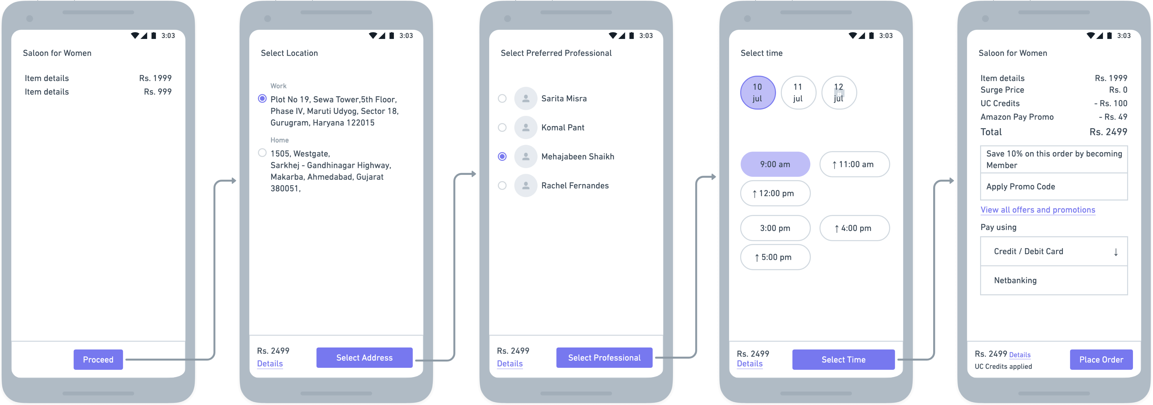
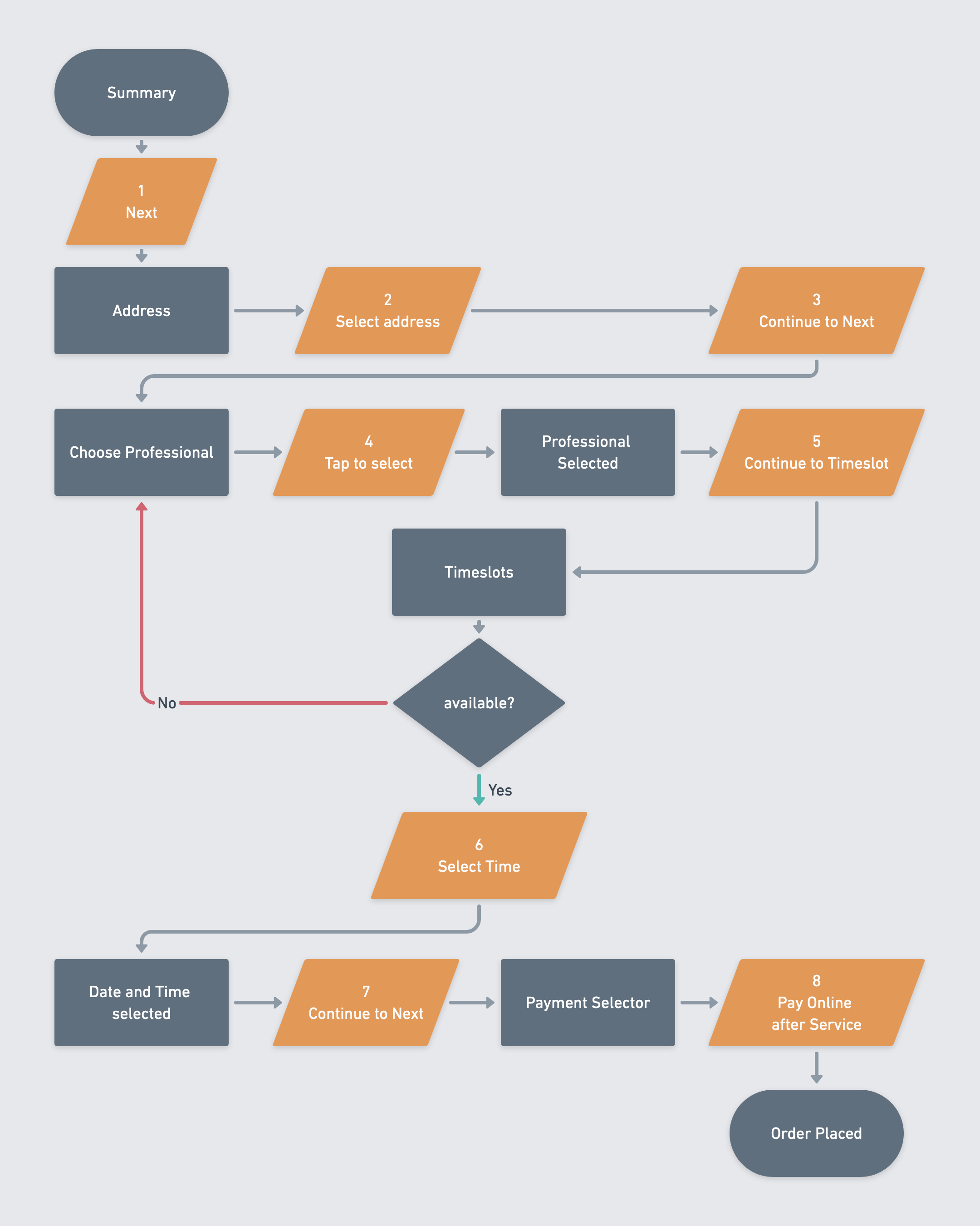
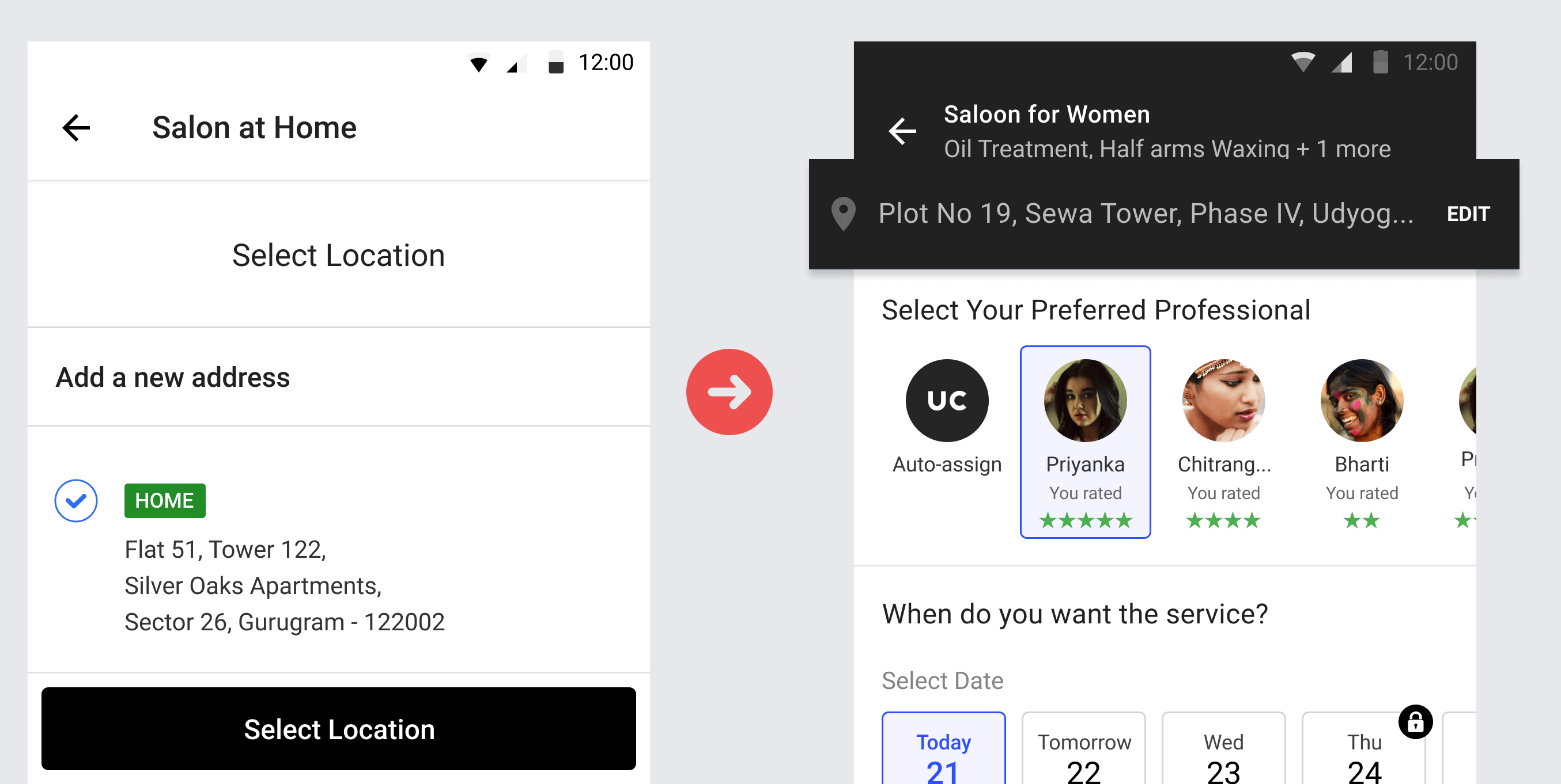
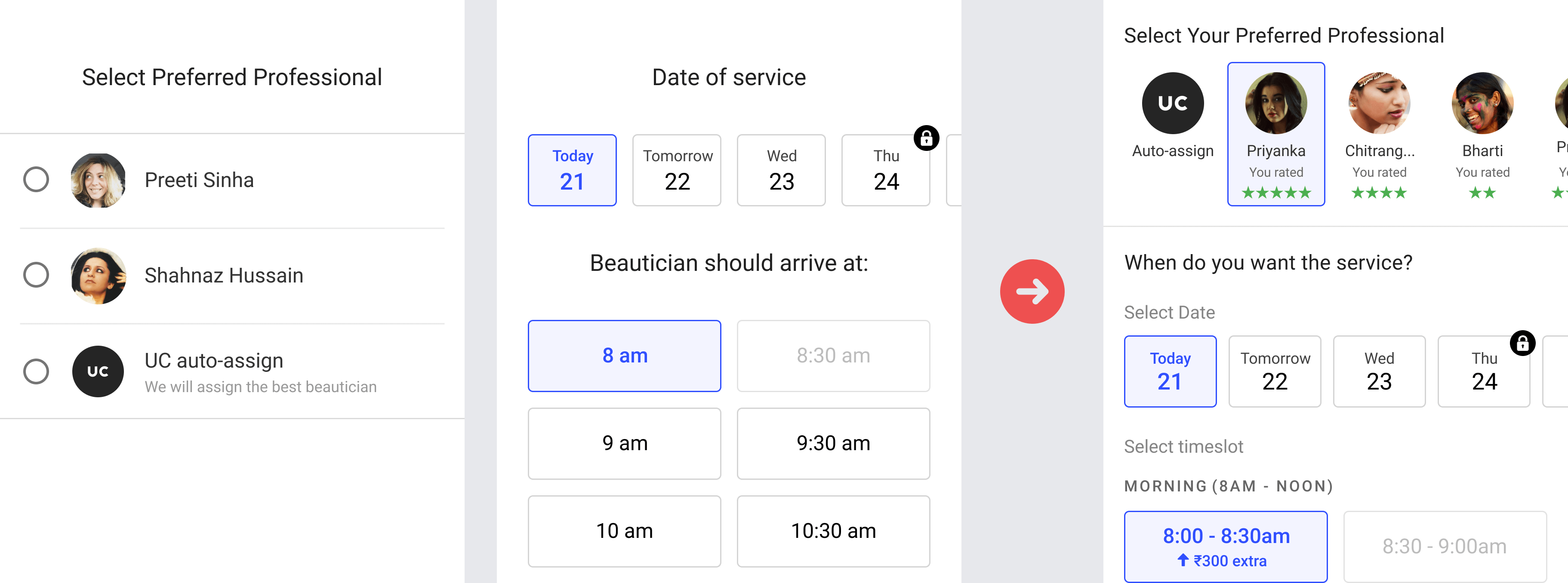
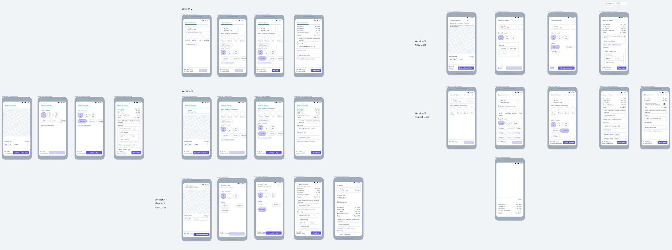
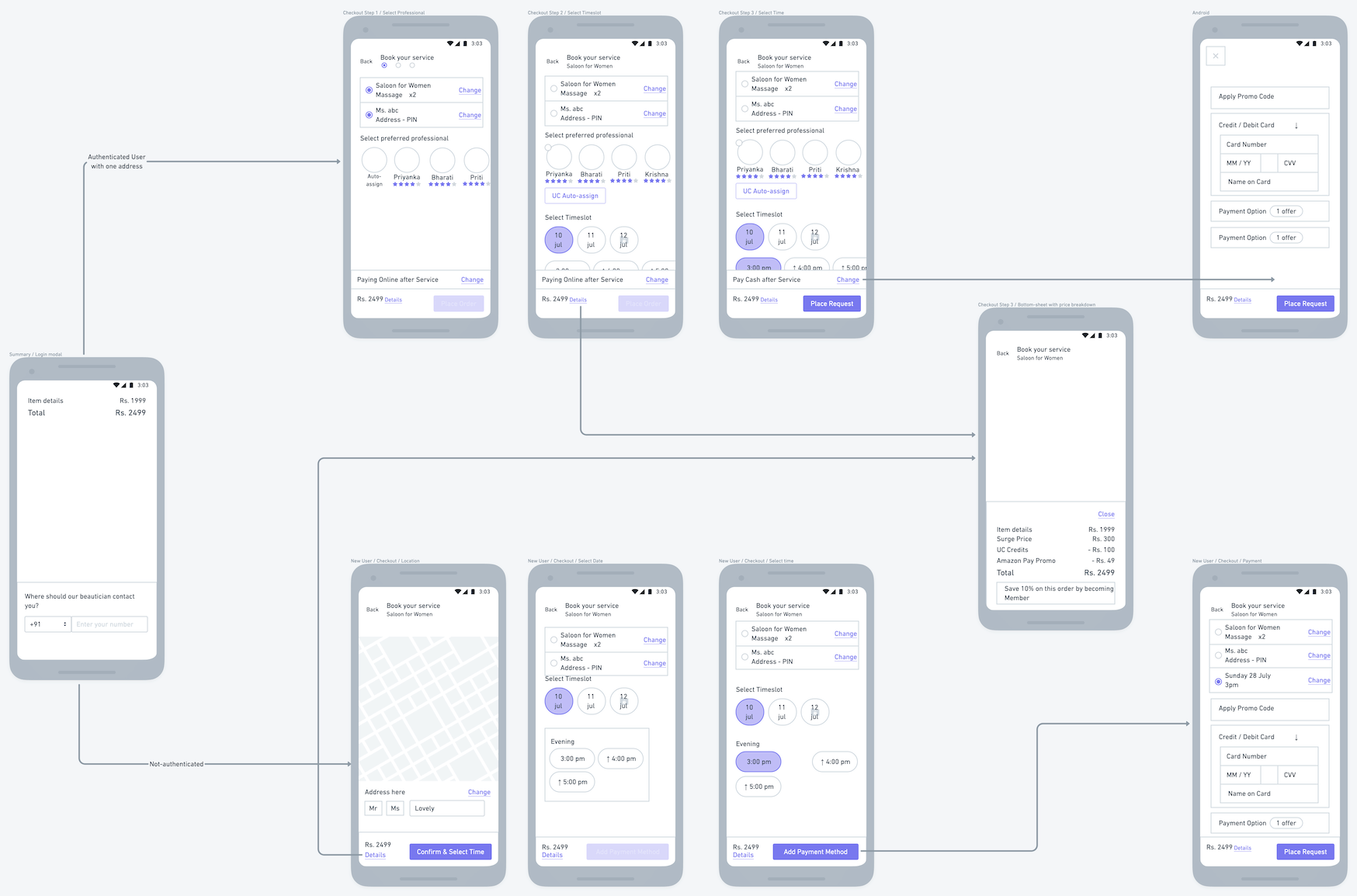
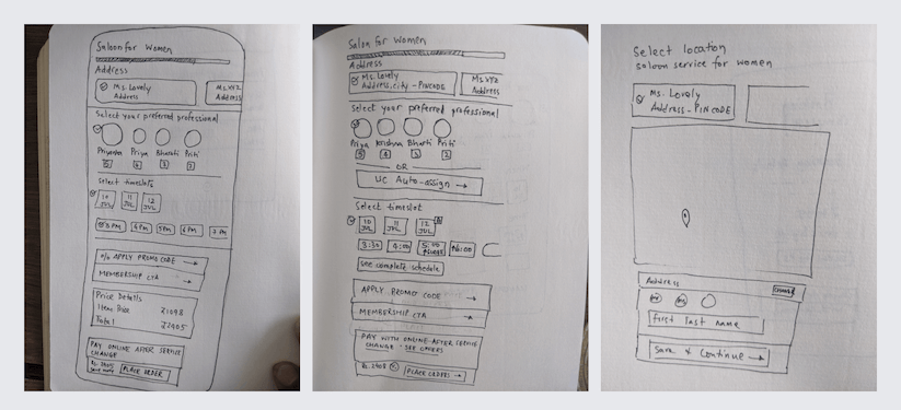
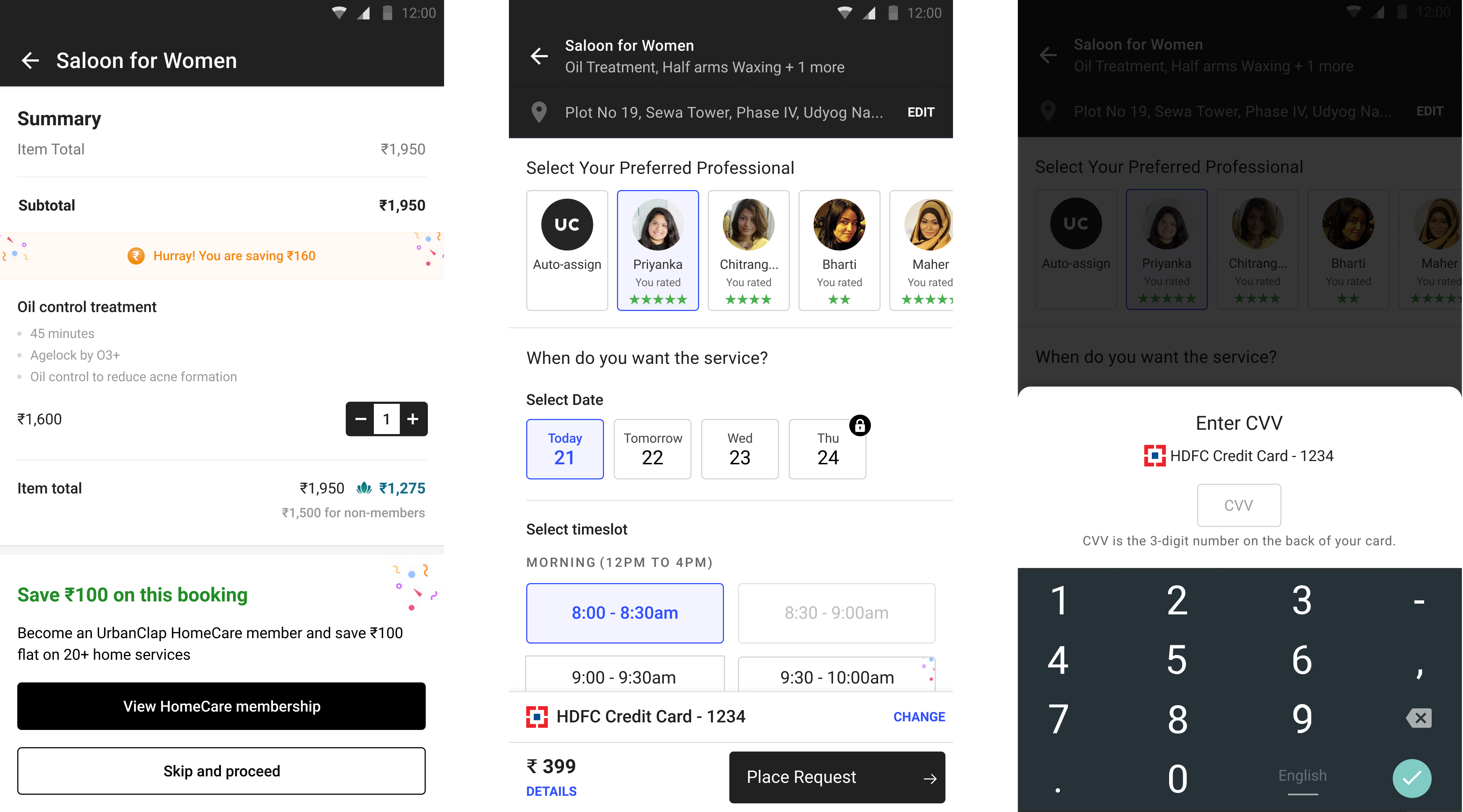
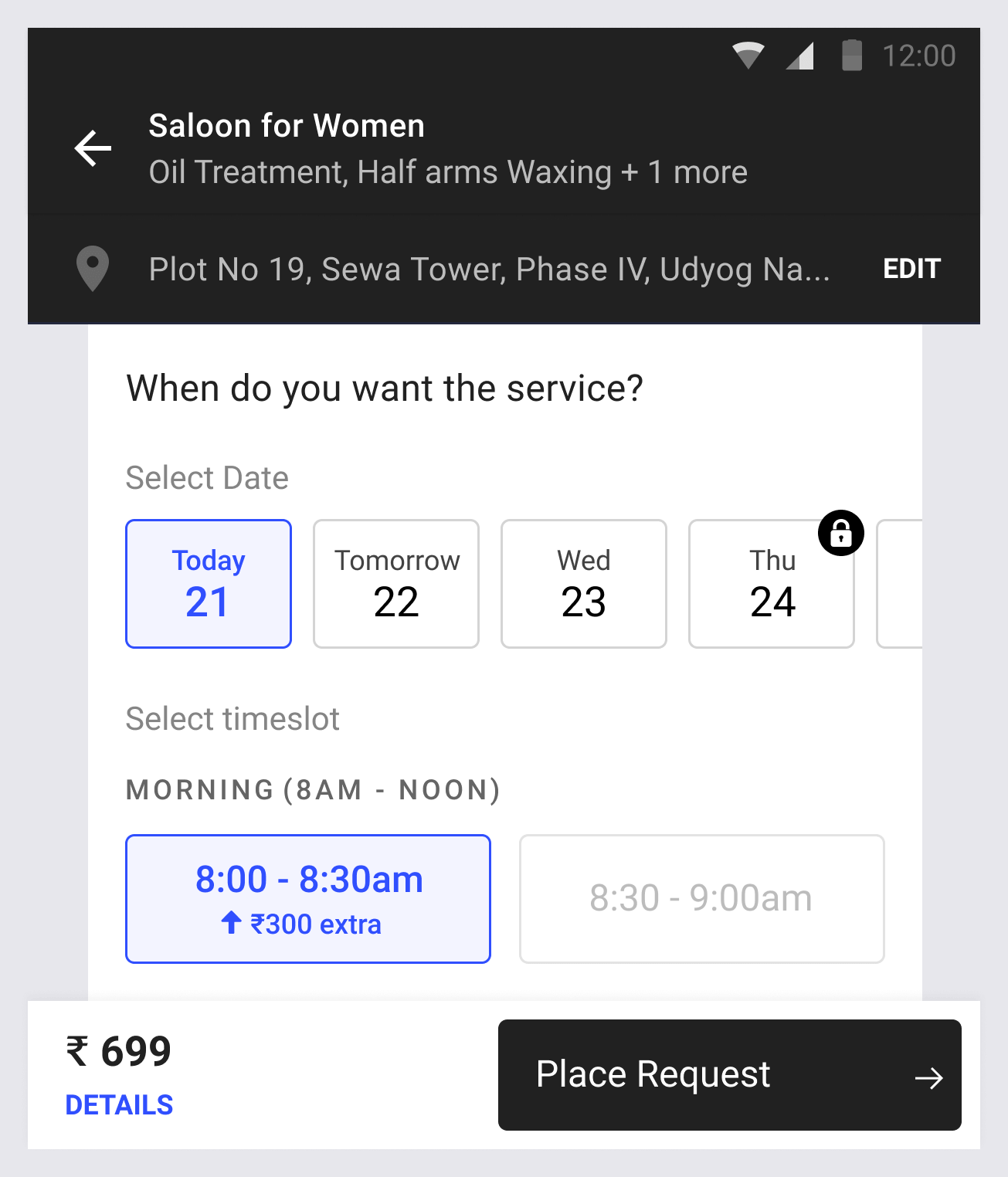
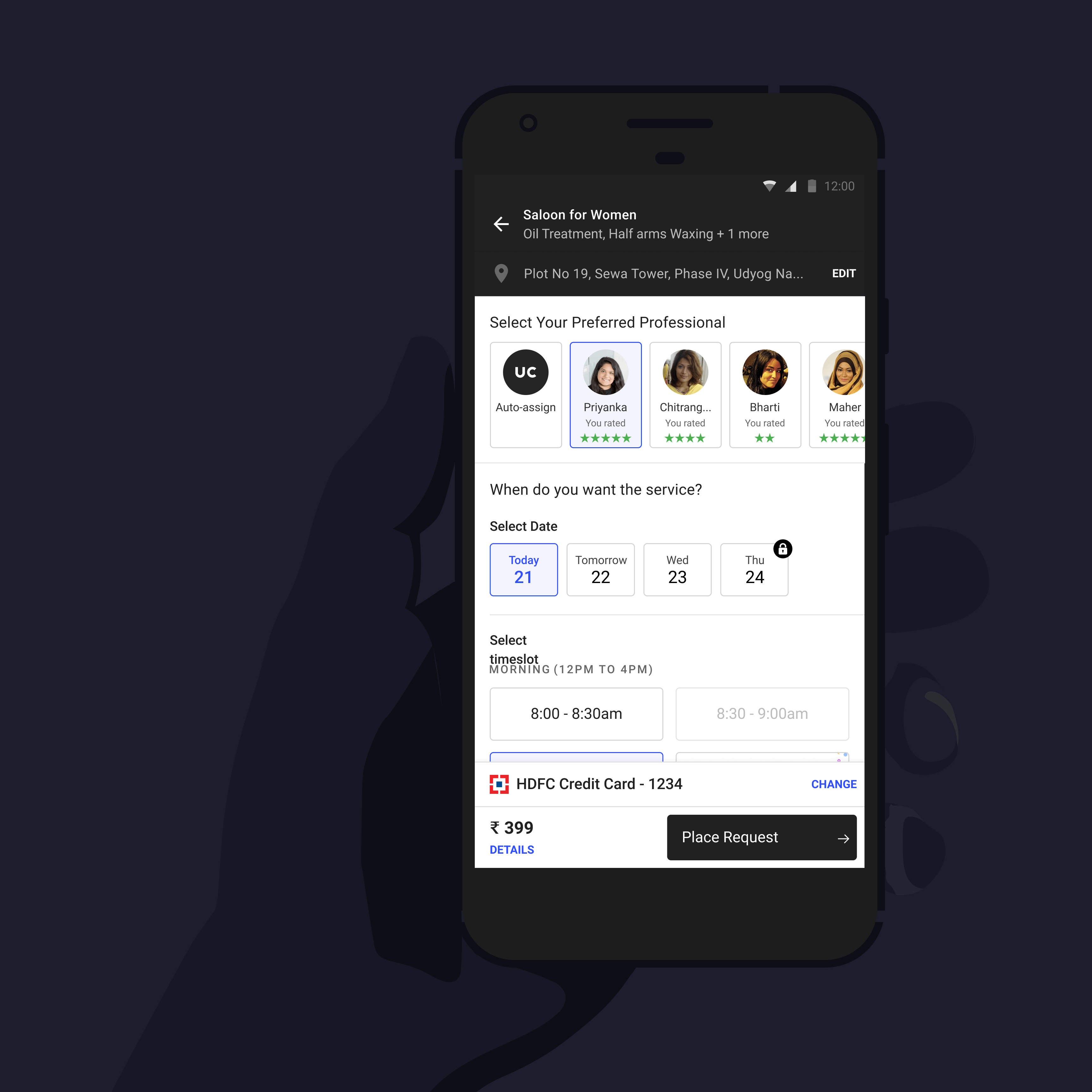
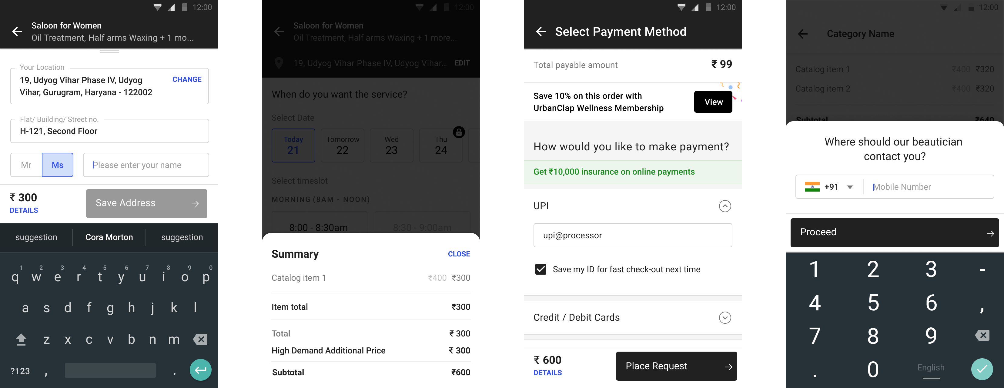
Urban Company (UC) reached out to us with the specific brief of improving their check-out experience.

They hoped to increase conversion rates for both new and returning users by:

  • speeding up the check-out and
  • building greater trust in the brand during check-out.

Could we design a leaner flow and reassure users, step-by-step, that they could trust the product?

User Experience
iOS, Android, Web
Goals

There were two segments of users: new users (booking their first service) and repeat users.

a. New users

The check-out flow for new users was straight-forward, with users required to provide necessary details for service booking and fulfilment.

Membership landing page hero continuing large typography from About
Check-out flow for new users, starting with summary through the payment
Summary

This is the first step of the check-out flow which shows users their selected service.

Add address

They are then asked to enter the location where they would like to receive the service. The location is placed on a map, and users can verify its accuracy or re-enter the location.

Time and service-provider selection

Next, they select the date and time they would like the service and UC auto-assigns a service provider to them.

Onboarding

Users provide their mobile number and enter the OTP sent on that number.

Payment

UC provides options for both online and offline payment methods. They offer a ₹10,000 insurance on online payments and want to encourage users to make digital payments when booking services.

b. Repeat users

The returning user flow was where the UC team saw a lot of opportunities to optimise the “time to complete task”. This was the juicy and exciting stuff we couldn't wait to dig into. Apart from selecting location and payment, the major step here is booking a preferred service provider and selecting a time-slot.

Check-out flow for repeat users

Approach

The first thing we did was to deep dive into UC’s existing quantitative data conversion rates and the time it took for people to check out. We interviewed product team members to get a sense of the decisions that had shaped the existing flow.

Number of interactions

Since we were working on a measurable goal, we started with simply counting the existing number of interactions necessary to re-book. In orange are the interactions - button taps, value selections - that the user had to carry out.

This number and the data we had formed the basis of next steps in design.

Orange steps indicate interaction required to re-book a service in the original flow.
Location
Five in six users had only one active locations on their profile.

Asking all users to select their address each time was redundant considering that data. It would be more efficient to make this decision for the users and let them change it if they needed to.

We pre-selected the user’s location during the re-booking flow, and omit the location-selection screen. If the user had only one address on their account, and they started their discovery with the same high-level geographical area, UC would pre-select their existing address for service.

Location is pre-selected for returning users which they can change, as well as add new address.
Service provider + time slot

Service provider and time slot was in our opinion the most unique challenge for UC. To be honest, location (and later payment) selection are problems solved by other e-commerce products. We could take inspiration from them and validate the solution against our data-set, but…

Solution

We combined the preferred service provider screen with the date and time-slot screen, so customers could check the schedules of the last 5 service providers they had booked at a glance. In case one provider did not have open slots, or had high-demand pricing, it was very easy to check another service provider's schedule with a minimum of effort and no further interactions required.

Then, to make selection of the service provider even easier, we limited the number of visible preferred service providers to five - if customer had not repeated service from a particular provider in five recent occasions, or had rated them poorly, those providers would not show up here.

Combining service provider and time-slot selections into a single step
The selection of preferred service-provider combined with date and time-slot selection on the same screen.
Payment

With the information and goals set for the payment, the users see their payment option pre-selected if they are repeat users. For new users, there are sufficient nudges to direct them towards digital payment methods without being too pushy.

offers on summary screen
User can view offers on the very first step, the summary screens. This incentivised them to pay with digital options.
the authentication step was moved to the summary screen
The authentication step is also part of the summary screen, so repeat customers can be directed to a flow better suited for their use-case.
Recently used digital payment pre-selected
Returning customers see their most recently used digital payment instrument (cards, UPI, wallets) is pre-selected.
Iterations and progressive implementation

Between the first and the final set of flows and wireframes, we suggested multiple options which could be implemented in stages, serving as a gradual improvement to the existing flow. From the tech team's perspective, this allowed them to release new features step-by-step with the easiest to implement being rolled out first.

The first thing UC implemented was the newly designed and critical “service provider + time-slot” section of the flow. By some miracle, the big time-saving feature for the users (combining the professional + time slots on same page) - which was our top recommendation - was the easiest to implement.

The final flourish

Utilising UC’s design language, we put the wire-frames into hi-fidelity visuals. As you can see, the check-out has been sped up so that it can be completed entirely on one screen!

flows for rebooking experience
Re-book experience, down from four steps to only one! 🚀 🥳

Check-out flow for new users with visual design

While there was not much possibility of drastically reducing the number of user inputs required for new users, we took the opportunity to optimise some micro-interactions (drop-down alternatives and designing ratings) that would make it easier for them to provide the required information easily. Moving onboarding to an earlier step of the journey allowed us to unify the experience for new and returning users, while providing more scope for evaluation of drop-offs.

flows for new users
Optimising micro-interactions: replacing drop-downs with segmented controls, moving inputs to bottom-sheet for quick access, keeping suggested payment options open.

You gotta have faith, faith, faith…

Throughout the re-designed flow, we clearly display the options selected by the user to provide additional visual assurance.

Information captured like address and services is reinforced in the product; any change to the cart amount is communicated immediately to the users.

In Conclusion

With the updated flow, we have cut down the time to check-out by 50% by eliminating all redundant taps and interactions.

The eight interactions that were required in the old flow have been reduced to four. While the previous flow needed users to go through three screens to re-book an experience, now the same process takes only one screen, increasing the perceived speed for the users.

credits —

Design

Kasturi, Tejas

Case Study

Manaal