 3 / S C
When we think of design systems, we often think of big, complicated ones like Adobe Spectrum or Shopify Polaris. These systems support large teams and complicated ecosystems, which makes them seem like they are too big for smaller teams or simpler projects. However, even on a smaller scale, a design system can still be a strong base, make things run more smoothly, and make products more consistent.
In this article, I'll talk about how we helped our regular partners, Able, make a design system for the admin portal of their Apex e-commerce.
Able came to us for help with a design system that could grow with their product. This was an exciting opportunity because it helped us prove that our work on MVP design systems and and let us work together on code components.
Prioritizing what’s important
The main challenge was the short two week timeline for phase 1 of this project. Fortunately, having been involved in the design of the product's initial version, I was already familiar with its structure. This, combined with our previous experience, made the timeline manageable.
But we had a short amount of time to make clear what we wanted to do. We talked with product, design, and engineering and came up with the following priorities for phase one:
- Build components that are essential and add the most value.
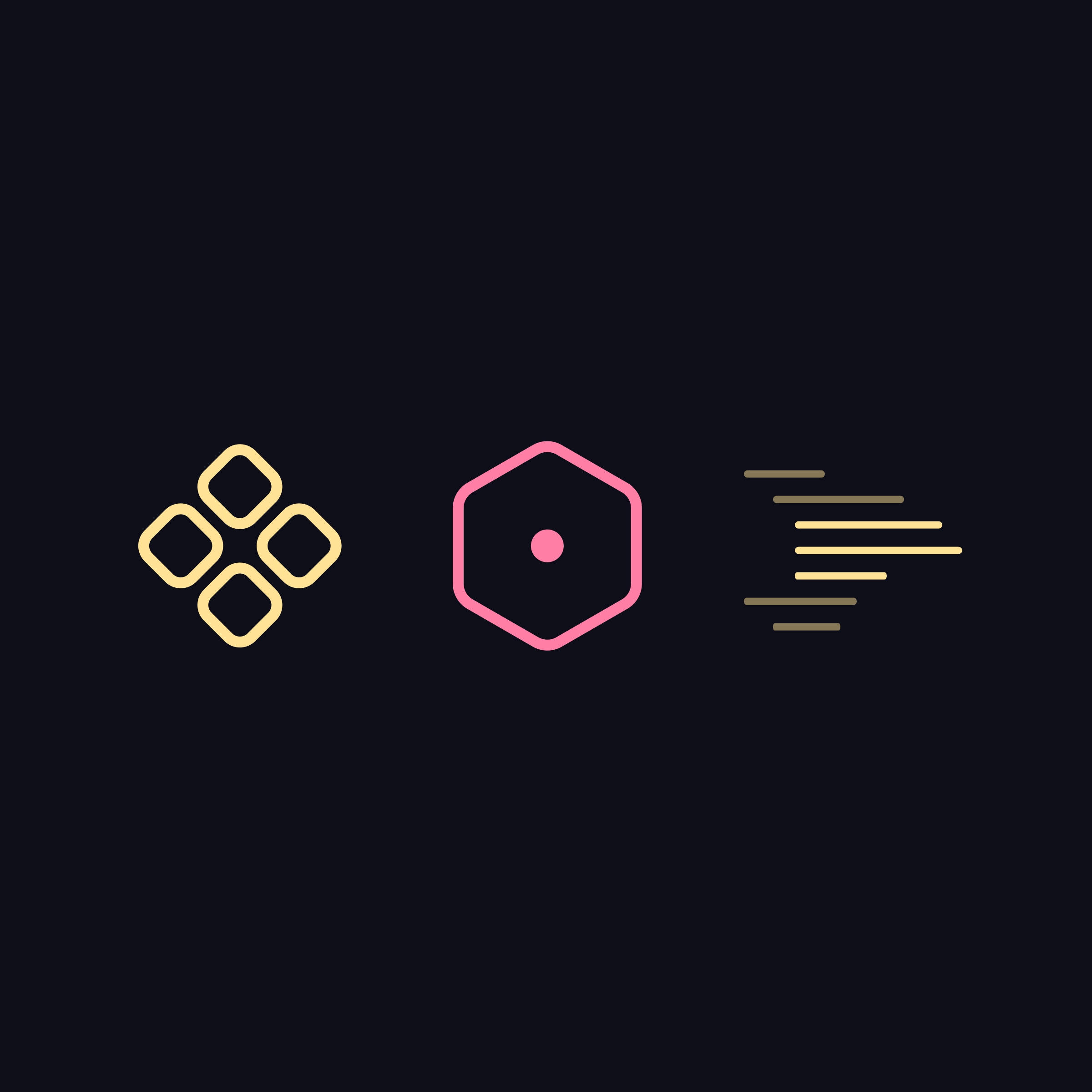
- Decide on how we approach theming.
 examples of theming
During the first phase, we decided to limit theming to certain interactive elements. In later phases, there would be more ways to customize things like dark mode, radii, typefaces, and more.
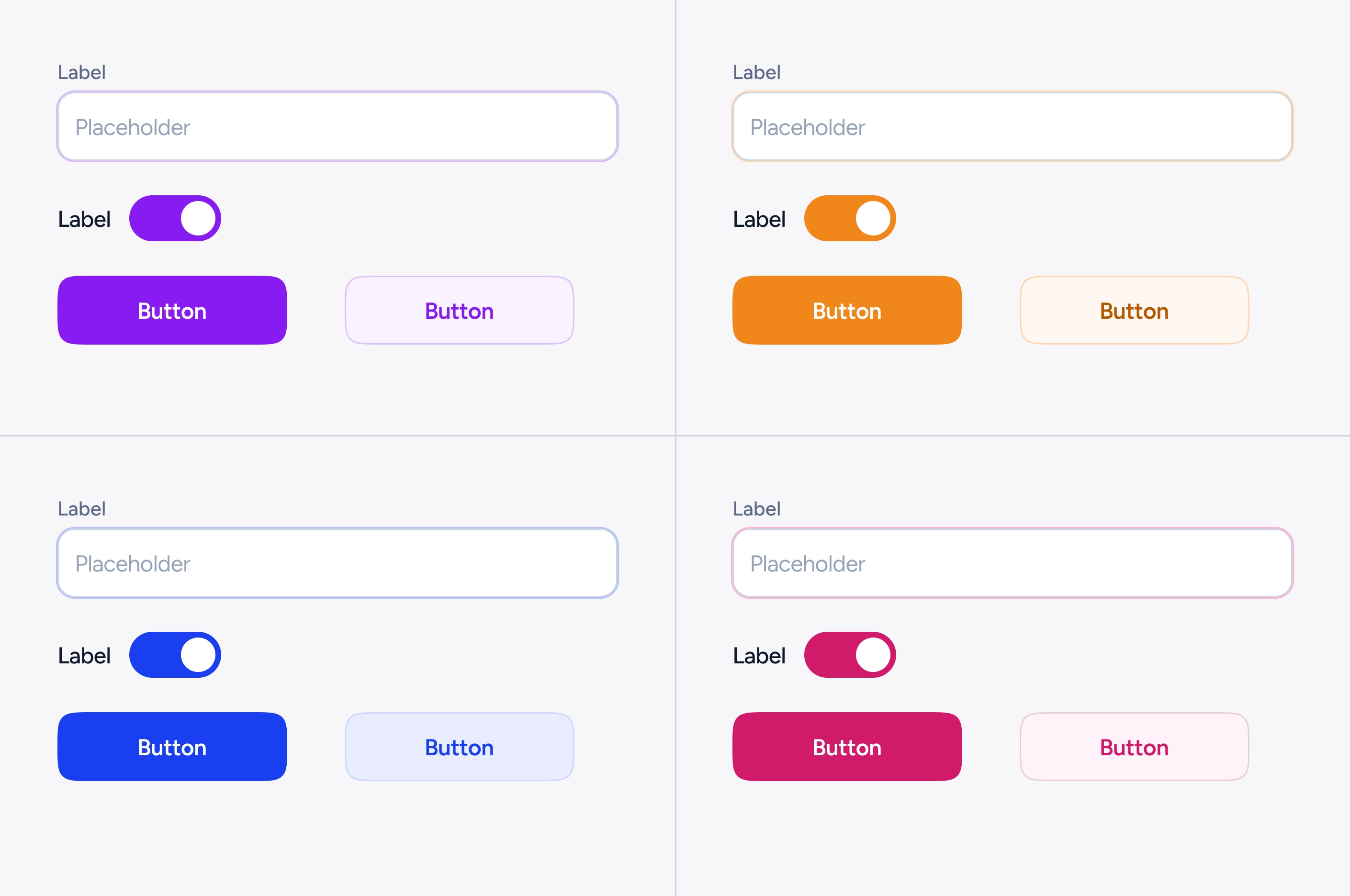
Colours and variables
From the start, our main goal was to build a variable structure that was simple to use and keep up with. We looked at the colors used in the finished designs with current and future theming goals in mind and put them into four groups.
- Neutrals colours: These are greys, used for background surfaces, text, inputs borders etc
- Primary colours: Used for certain interactive elements like buttons, switches, tabs etc. These would support basic theming mentioned before.
- Special colours: Used for specific elements like tags, status etc.
- Feedback colours: Used to convey success, danger, warning and info messages, destructive actions etc.
After the audit, we defined three collections Primitives, Special and Semantic colours.
Primitive colours: Traditionally primitive colours are named without any semantic meaning (greys, blues, reds etc). We instead chose to take a semi-semantic approach to naming them. We went with greys, theme, success, warning, danger, info and translucent. We chose this approach because it was easier to support theming.
Special colours: As mentioned above, these colours would be used in one-off components. We separated these out so that they would not accidentally used elsewhere in the app.
Semantic colours: Initially we started out grouping these variables as neutral, interactive with background, text and border subgroups. This approach however proved more complicated and confusion. For example, a tab is an interactive element but still uses the neutral background. So instead we with a simpler grouping of background, text and border.
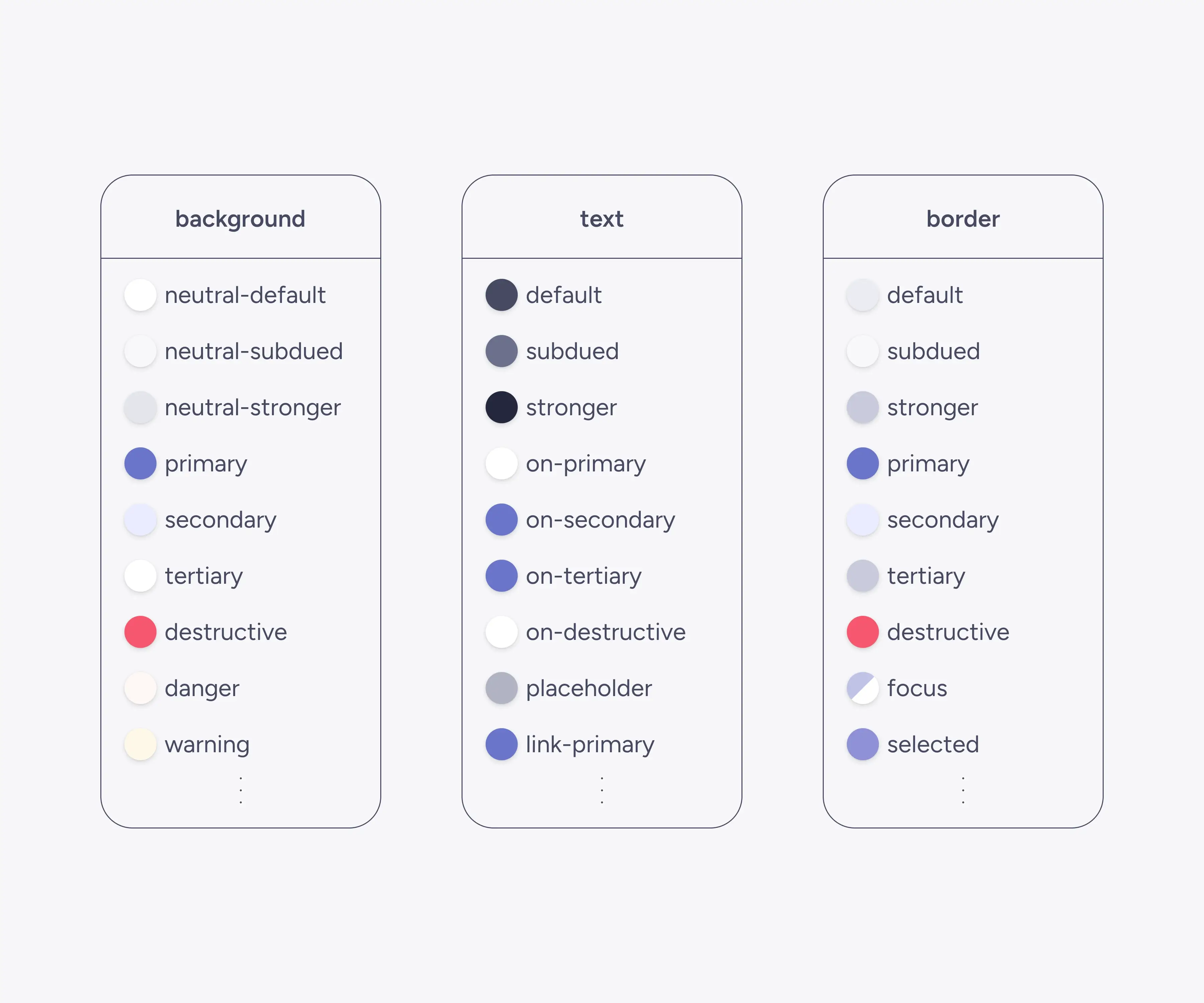 some of the semantic colour variables
Interactive states
Rather than defining new colours for interactive states (hover, active, etc.), we layered state modifiers on top of default states. This approach kept the color palette more manageable while supporting all necessary states.
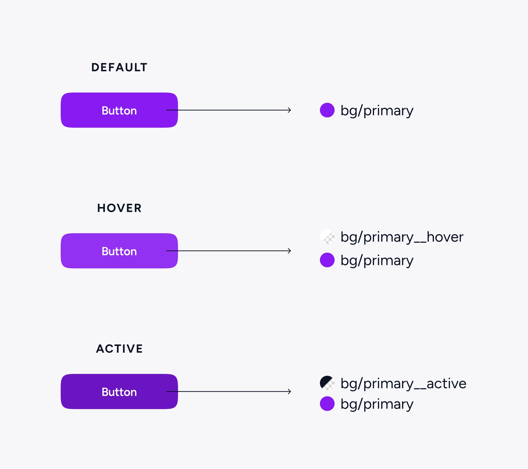 interactive states using modifiers
Numbers and typography variables
We made separate collections for typography variables and used these variables to make type styles. We kept our number variables simple on purpose, using semi-semantic categories like spacing, radius, stroke sizes, and component dimensions. At this point in the project, adding more detail didn't seem to help in any clear way.
Documenting components
Given the tight timelines, we had to be very efficient in documentation. We used consistent emoji to clearly convey component properties and documented these.
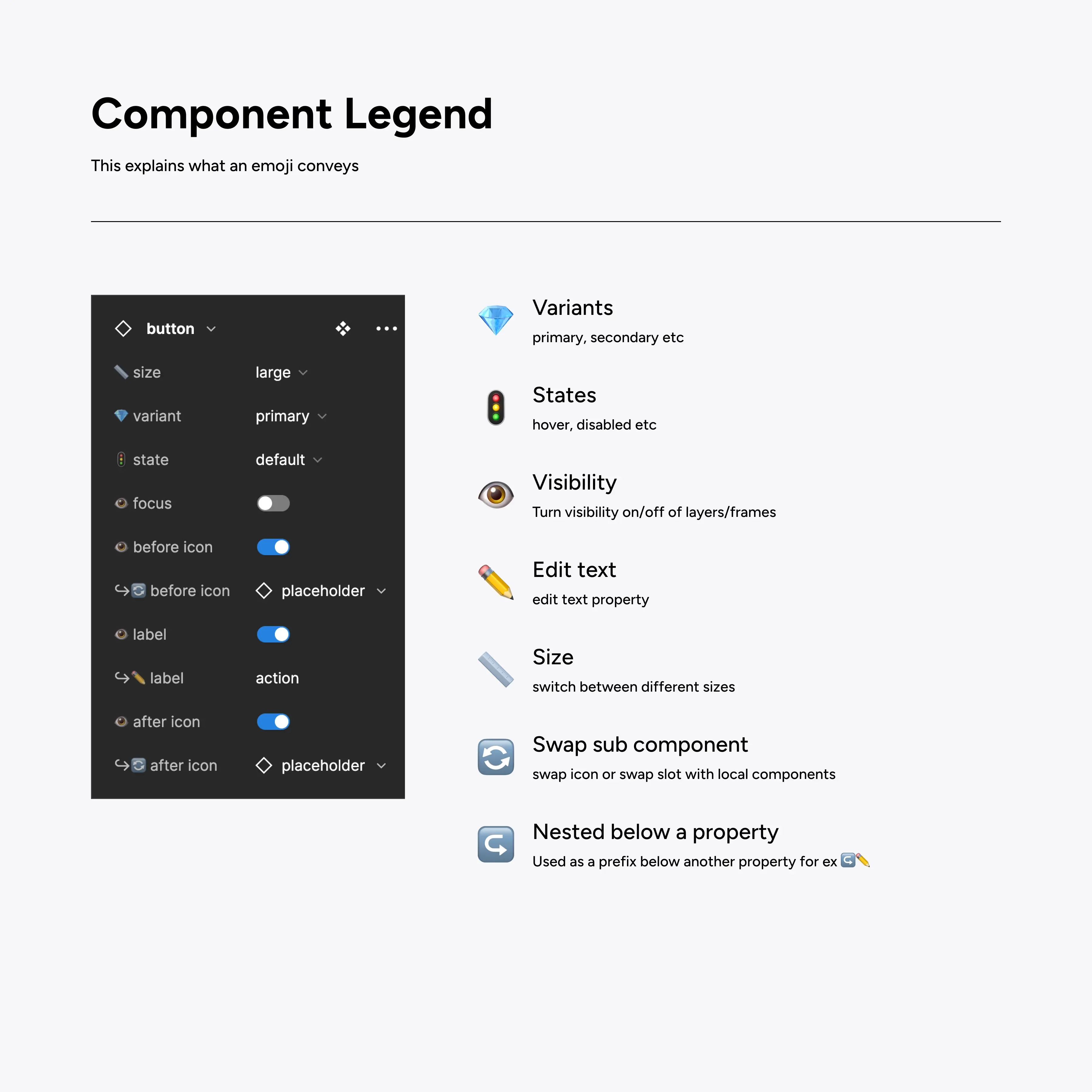 component legend
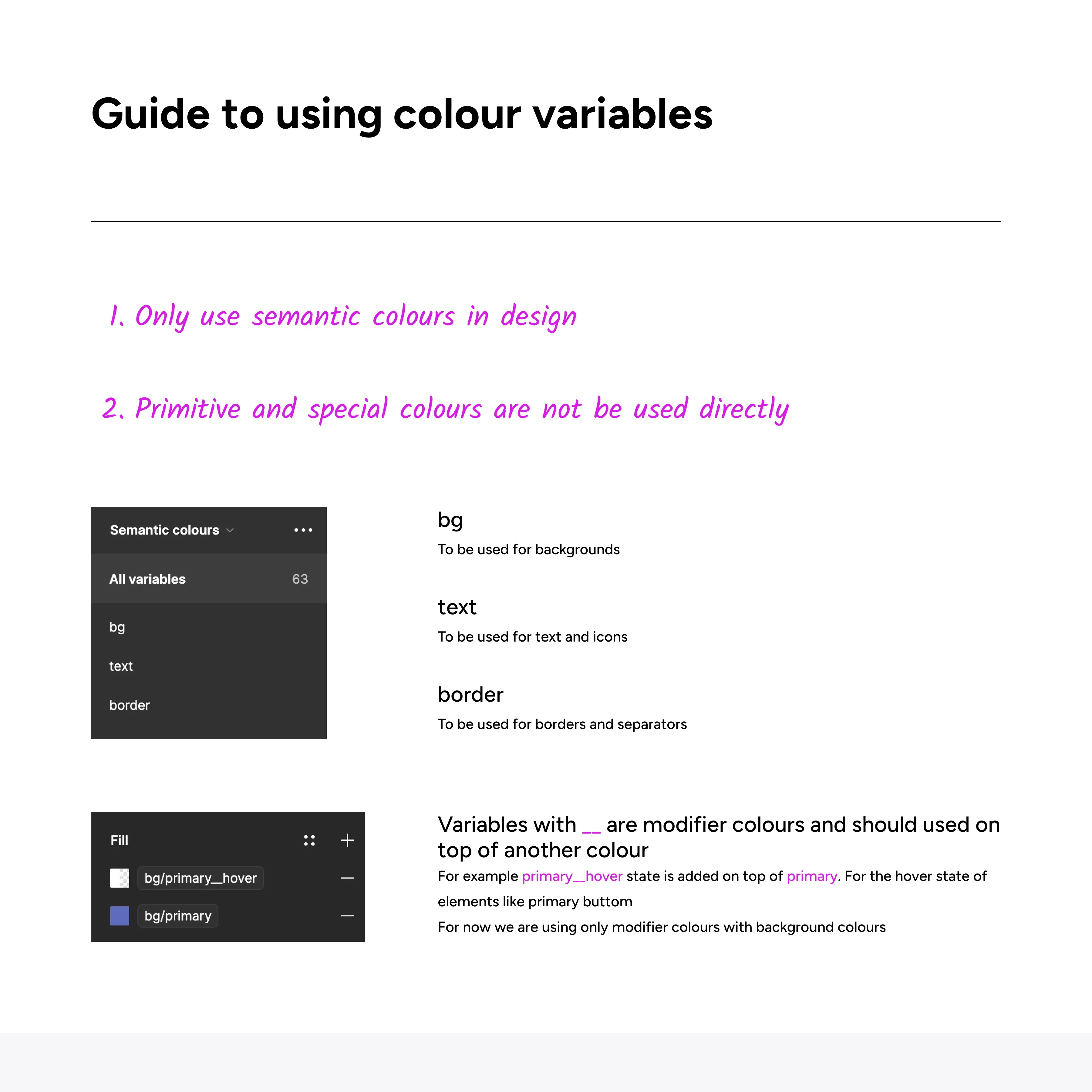 guide to colour variable names
For more complex components like tables we created more detailed guide on how to use them inside Figma.
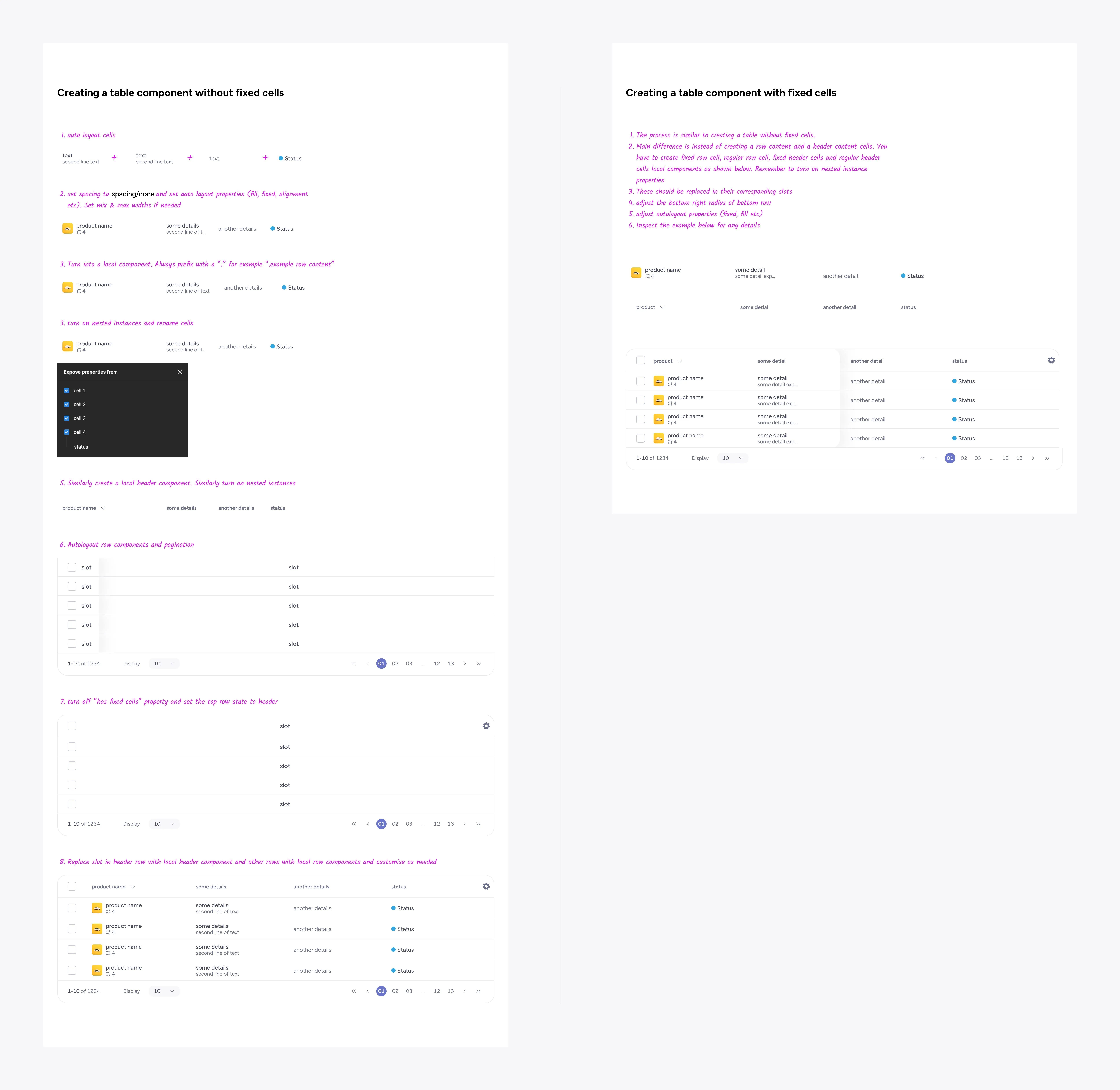 guide to using a table component
Conclusion
We made this design system with ease of use and scalability in mind. It gives us a strong base that can change and grow as Able's products do. We learned more about how code components are made by working closely with developers on this project. We are excited to help more teams take advantage of the benefits of design systems.