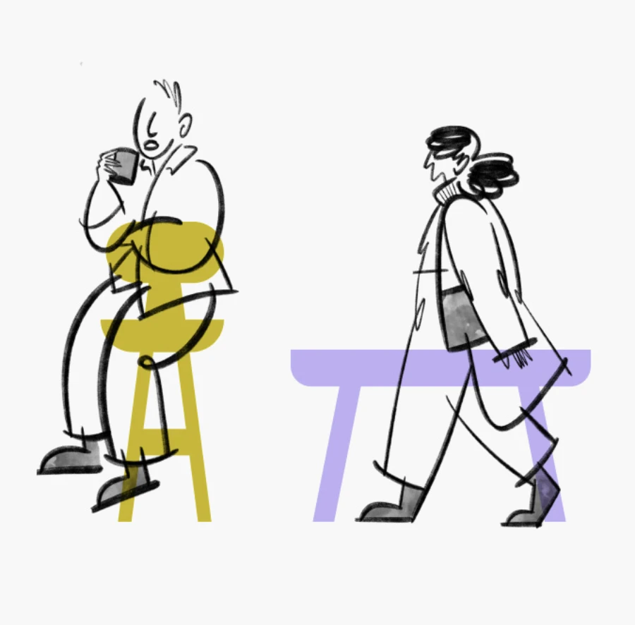
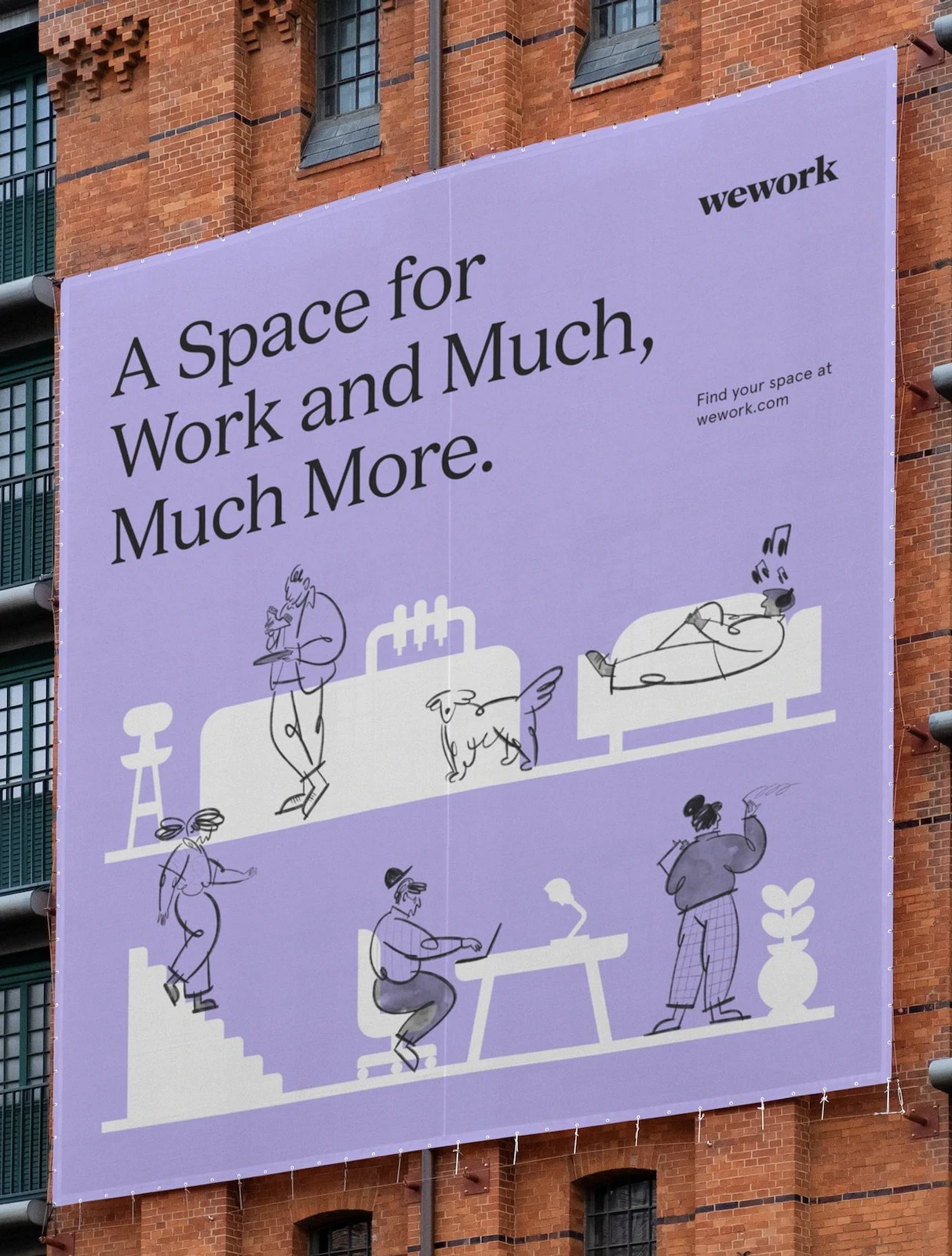
I came across WeWork’s new illustrations when checking out their rebranding review on brandnew and what immediately caught my attention was the simplicity of illustrations. Designed by Franklyn, these illustrations aptly capture the global essence of WeWork. Let me elaborate why.
All images in this post are properties of Franklyn and WeWork. We are not associated with either parties.
The style can be divided into two key elements:
- loosely sketched depictions of people engaged in various activities, and
- colour-blocked simple shapes.
 WeWork’s illustrations consist of loosely sketched people over colour-blocked shapes
The rough, pencil/brush strokes used to portray the people struck me as a representation of the dynamic nature of individuals in WeWork spaces. It conveys the idea that people are constantly in motion, reflecting the ever-changing and adaptable nature of the WeWork community.
In contrast, the solid-coloured, minimalist shapes symbolize the permanence and stability of the office space and its elements. It’s as if these shapes are saying, “Feel free to come and go as you please, and we’ll be here, ready to provide you with a workspace whenever you need it.” This juxtaposition of movement and permanence captures the essence of WeWork’s promise to offer a flexible and reliable work environment tailored to your needs.
The message ties in with the content on their website as well.
 voice and tone goes well with the lightness of graphics, except crow’s foot passing as single quote 😉
To sum it up, WeWork’s new illustrations by Franklyn capture the blend of lively community and reliable workspaces. These visuals represent WeWork’s promise of flexibility and support, reflecting their global presence and commitment to helping people and businesses adapt in a changing world.
 3 / S C

