WHAT A RIDE!
We just turned 15! A massive shout-out to everyone who’s hopped on this wild ride of 14 years with us—our fabulous clients (past and present), colleagues, brilliant collaborators, partners, steadfast friends, our cheerleaders; people who inspire and teach us—you rock! Thanks for shaping our story with your support. To more kick-ass adventures! 🍻
Our Canoo case-study was published on The Hard Copy. And our footer was featured on Footer Design next to Tobias Van Schneider and Vercel. Party time!
On to the news section then...
Team
Kasturi finished 5 years at 3 Sided Coin. Someone committing 5 years of their insane talent at a small studio is a validation that we are doing something right. She is right now taking a 3-months sabbatical, and don’t we all envy her!
Community
Secret Sauce of Design Hiring
We hosted Bhakti (Chief Design Officer, Aubergine Solutions) and Sanjay (Being User) in a small panel to talk about Secret Sauce of Design Hiring as the last event before summer in Ahmedabad kicked in. What was supposed to be a tactical discussion ended up being a fantastically deep and thoughtful conversation about how to think about careers, especially as designers.
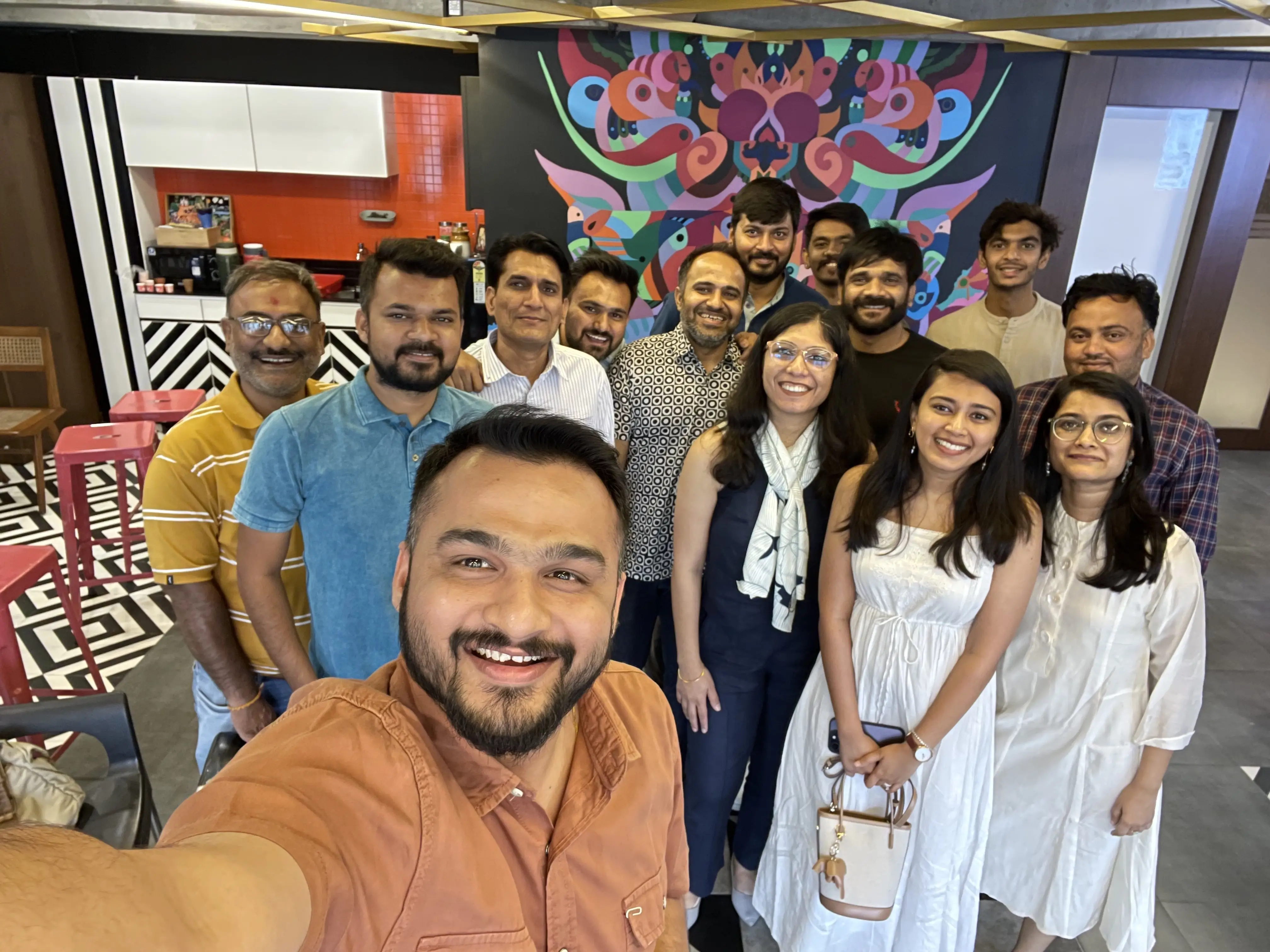 happy faces with bhakti and sanjay
ODD 🤝🏽 3SC
As skies rained fire everywhere since April, we shifted our community catch-ups online. Here’s studios Office for Digital Design and 3 Sided Coin jamming over a call as people joined from all over the country.
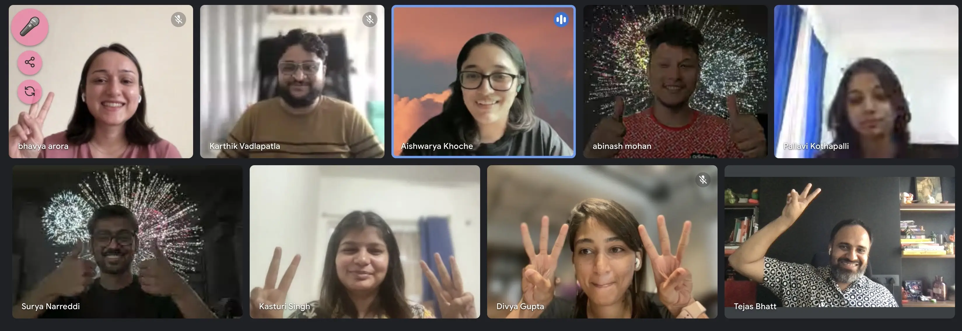 ✌🏽✌🏽
✌🏽✌🏽
Work
Last quarter saw a lull in client work. At one point we had more inquiries in a week than what we used to get even in better times, but these conversations came with long lead times which has made planning impossible.
So we spent time adding more playful rizz to our website as previously teased. We have a solid story now on the website that highlights our playful nature as an agency. These animations did some good numbers on social media.
We also categorized our research & design work by product and editorial + web on the site, with new case-studies for Flipkart Health+, Harappa Education, Sahamati (Account Aggregator), and more.
In June, activities picked up with us making new things for Canoo and a couple of smaller engagements. We can’t wait to show you what we are making!
Here is what Daniel Bernhard, CEO of Institute for Canadian Citizenship—Canoo’s parent org—said about our work for Canoo app:
We get compliments all the time that the Canoo app is very handsome and “slick”. As a non-profit organization, people expect our app to be second-rate, and they are pleasantly surprised to see that it's nothing of the sort! Daniel Bernhard
Experiments
Tons of XR experiments!!! We teased one in our last newsletter, and it came out pretty amazing.
The first experiment imagines a medicine order journey, using medicine scan. Users can then interact with the available products and see details like ingredients, etc. See for yourself! 👇🏽
When we shared this demo around, people wanted something they could interact with. So we built the next two with Spline.
Imagine it’s a Thursday evening and you are sitting with your VR goggles on. You want to pull up your watchlist and stream something. But it’s not available in your region. In the first experiment, Abinash imagines VR-VPN that you can use to connect to global servers and watch your fav show right away.
Here’s the interactive version on Spline.
The next one is a mini narrative with books and lamps in a cozy set-up. Go play on Spline now!
We are very excited by the possibilities of this new interactive paradigm. Our previous work for Apple award-winning Froggipedia gave us some exposure to the XR design domain, and we are your team if you have an idea. Hit us up!
Writing
Few interesting things upfront:
- Last year we volunteered with Sahamati to create loan application UX flow and guidelines for Account Aggregators, building on top of Ideo’s work. Avinash recollected the experience in this write-up that designers from Ideo are also loving.
- How do you gamify a user experience? Every product designer / manager / owner wants their products to become more engaging by gamifying it. But there aren’t many pointers on how to design such an experience. Karthik wrote about our approach to gamification for Harappa.
- If you are a designer who creates colour palettes for UIs, you may have a few processes to create your colour ramps. In all likelihood, you are doing it wrong. How do you create colour palettes the right way then?
- There is a certain magic in web experiences tailored to large screens, similar to how some films work better on 70mm screens (Chris Nolan said it, and we approve). Here are a few of our favourite desktop web experiences.
Good Stuff
🆓 No-BS SaaS Website (10 templates) Freebie
We made a SaaS template. No bloat; clean, minimal, and packed with 10 essential layouts you actually need, our template lets you focus on adding your brand’s flair instead of deleting junk. Also, it’s FREE! Copy to your Figma↗
We have a premium version of this template in works with a whopping 24 screens, that we will launch at an introductory price of $149 $89 (60% off).
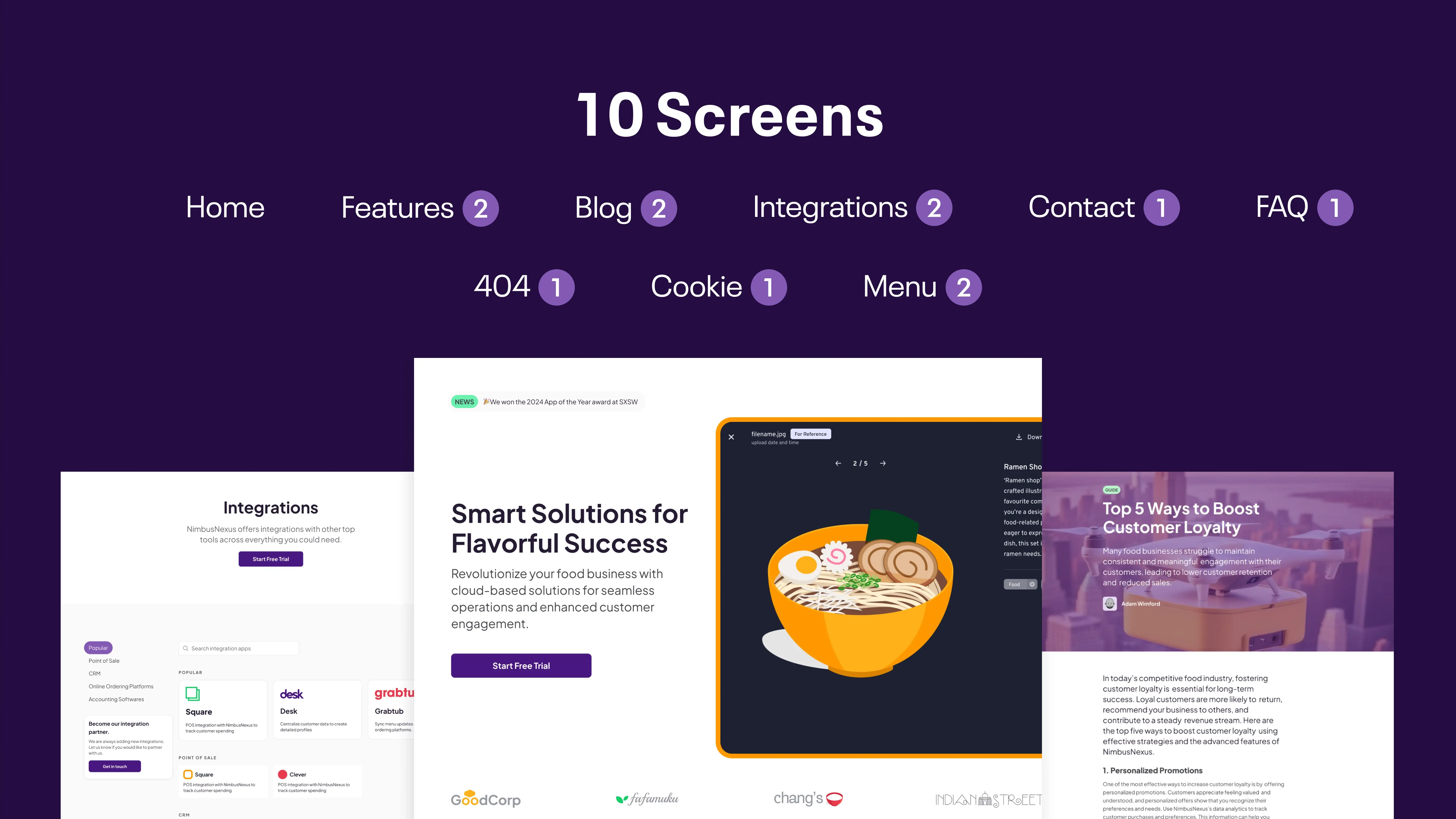 This no-BS free SaaS website template comes without any design baggage. It has 10 templates including Home, Features, Blog, Integrations, Contact, FAQs, 404, and Cookie pop-up.
Play
What does play mean to you? To us, it means not being afraid to fail, and incorporate fun to solve serious business problems. Tell us how you add play to your work!
Future
As we keep killing it with our experiments, what gets us fired up is client work. We are looking for new projects across product design and editorial & web design, to show our skills in context of some kick-ass work. On side, we are building all our internal projects in public, so follow us on Twitter and Instagram to hear about them.
Colophon
header typeface: nabla, header designed by: tejas
 3 / S C
